Options
Options are user-defined custom inputs that are used throughout Morpheus. Depending on the type of Input being created, users may need to create only an Input, or it might need to be paired with an Option List. Option Lists are static or dynamic lists of selections that would be associated with an Input if the user must make choices from a select list or typeahead field. This section discusses how to create different types of Inputs depending on the situation and powerful tools the user can take advantage of, such as dynamically filtered cascading inputs, logically generated Option Lists called from local or remote sources, and more.
Forms
Forms are designed to be used with Catalog Items. Using the provided tools, build forms to provide the appropriate customization fields for endusers in the Provisioning Catalog. Catalog Items can also be built using Morpheus Inputs but Forms provide unique capabilities that open up additional functionality and simplify the process. Once a Form is created it is then available to be associated with a Catalog Item. This section discusses the creation of Forms, the available options, and how they can be used effectively to create Catalog Items.
Adding Field Groups
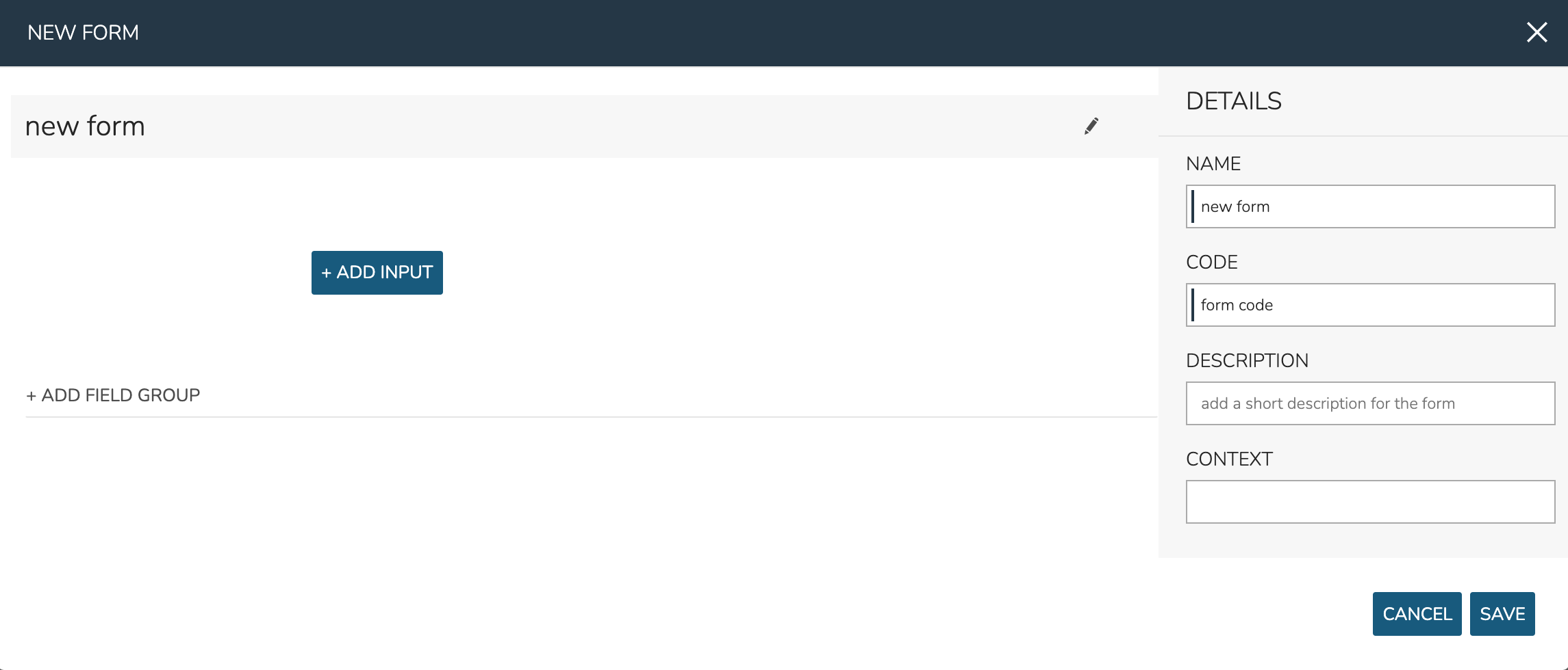
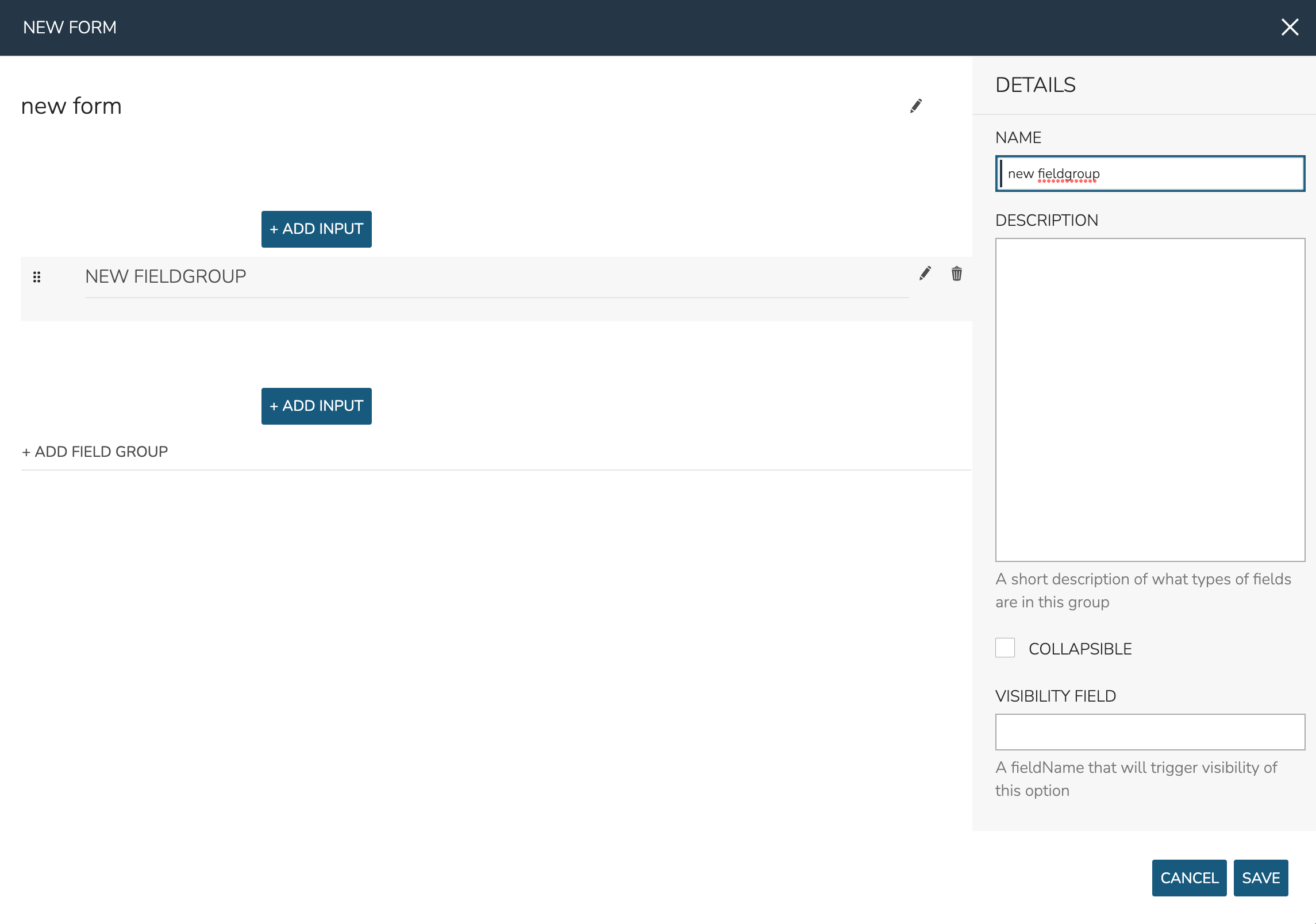
Field Groups are logical groupings of Input fields on your Form. Especially with larger forms, they make the Form easier to read and use. You can even collapse down sections of less commonly needed Inputs to keep your Forms clean. By default a new Form has no Field Groups but one can be added by clicking “+ ADD FIELD GROUP” in the center of the NEW FORM modal (which can be seen in the screenshot above). Field Groups can accept the following options:
NAME: The name and label for the Field Group
DESCRIPTION: And optional description for the Field Group
COLLAPSIBLE: When marked, the user can collapse (hide) or show the Field Group
COLLAPSIBLE BY DEFAULT: If the Field Group is marked collapsible, this option will appear to make the Field Group shown (unchecked) or hidden (checked) by default
VISIBILITY FIELD: Enter the fieldName of another Input and this Field Group will appear only when that Input has a value
Adding Inputs
Inputs are the Form options themselves and can take various forms, such as text fields, checkboxes, select lists or other custom forms. Inputs can be added outside of any created Field Groups or they may be added within them. Click + ADD INPUT within the desired area (inside a Field Group or outside of them).
When adding Inputs, you may add any Input (Library > Options > Inputs) that is pre-existing to your form. Set “USE EXISTING” to “Yes” and make the selection from the “EXISTING OPTION TYPE” typeahead field. Once selected, you’ll notice that all other settings cannot be edited. If needed, edit this Input within the Inputs section (Library > Options > Inputs).
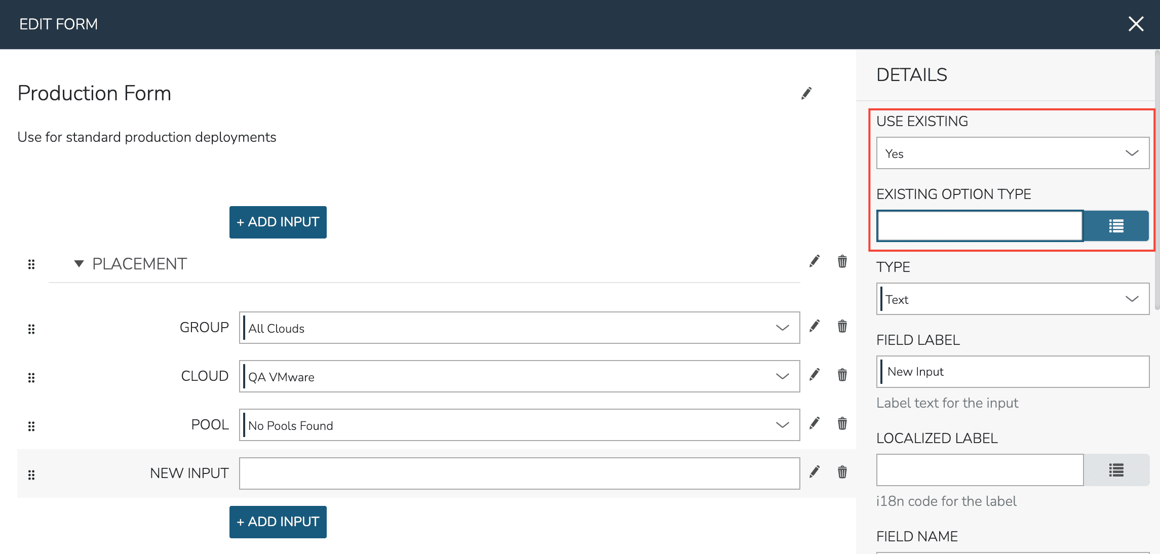
When adding Inputs, you may also create new Inputs within the Form builder. Some available types are no different than other Inputs you might make in the Input section (Library > Options > Inputs) but other types are unique to Forms. To create a new Input, set “USE EXISTING” to “No” and select the desired type.
Input types are organized by categories. Inputs in the basic category are primarily the same types of Inputs that can be made in the Inputs section (Library > Options > Inputs). These include text fields, select lists, checkbox arrays, numerical inputs, and more. You can read more about the basic Input types in Morpheus Input documentation.
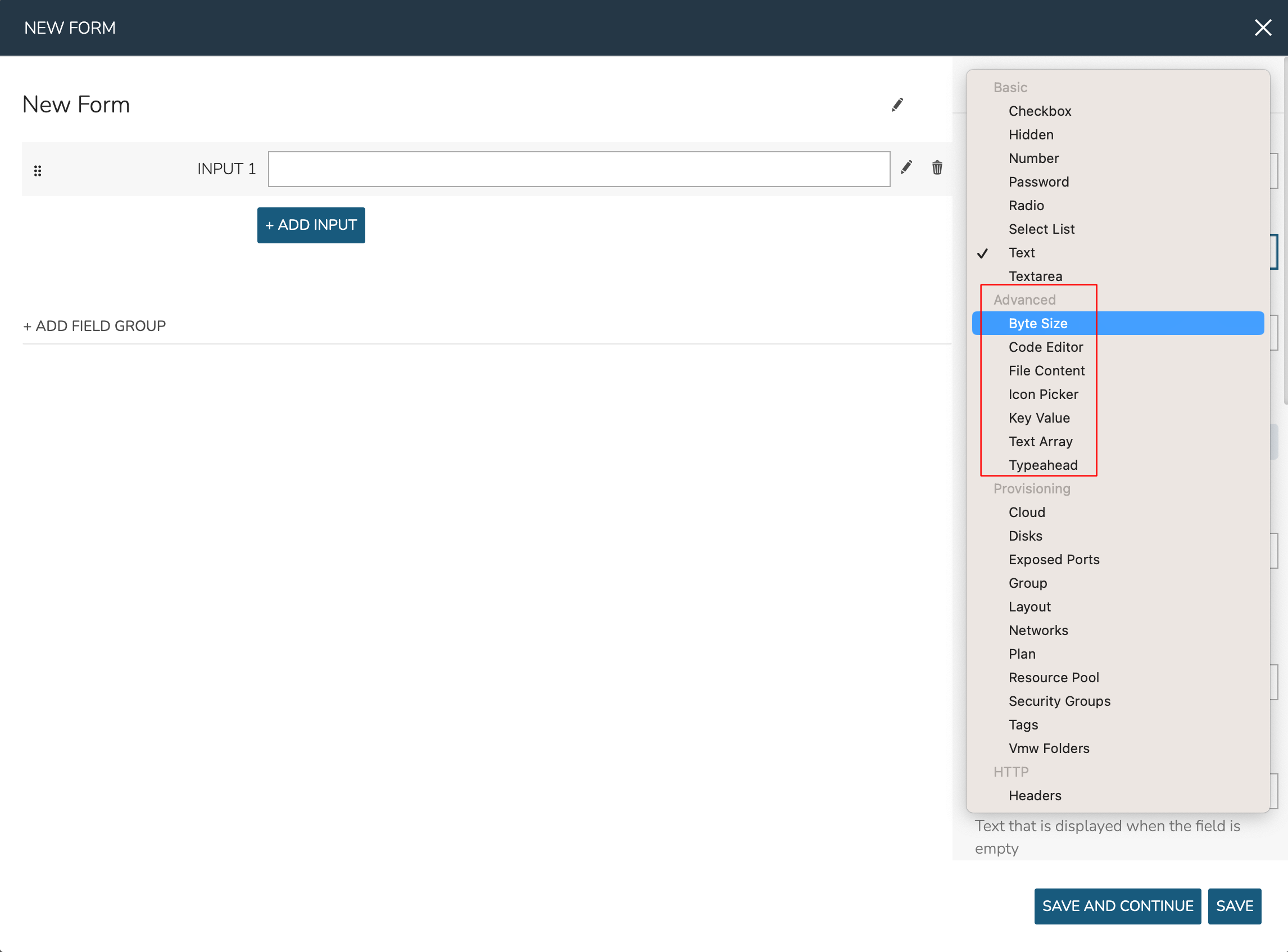
Inputs in the Advanced and Provisioning categories are unique to Forms and require additional explanation. Advanced inputs are similar to basic but provide some sort of data manipulation capability or have a specific targeted function. See the list of advanced Input types below:
Byte Size: Allows numerical disk or storage size values to be given with selectable units (MB, GB, etc.). When a value is input and the unit is changed, the same value will be automatically computed into the new unit amount (1 GB > 1024 MB, for example). Users may select which unit is initially loaded by default.
Code Editor: Gives the user a code editor field. Set a language or markdown format in the “HIGHLIGHTING” field to enable automatic syntax highlighting and spacing for the user. For example, the user could enter a provisioning shell script for their workload or provide a custom JSON payload at provision time (complete with syntax highlighting for easy entry).
File Content: Access file content either locally entered or sourced from an integrated repository or outside URL
Icon Picker: Allows the user to select an icon for their workload at provision time. The user may select from previously uploaded icons, upload their own, or use the built-in icon generator tool to create a unique icon right in the Form
Key Value: Allows the user to enter as many key/value pairs as they’d like which can be onboarded into the workload config at provision time
Text Array: Allows the user to enter multiple values separated by a delimiter of your choosing. Morpheus will parse out the entered values which can be individually deleted if desired before the form is submitted
Typeahead: Similar to Select List, especially for very long lists. Search for the desired value by typing the first few letters as a search parameter. Users may also browse the complete list by clicking the dropdown icon. This Input type can also support multiple selections, if needed. Associate this type of Input with a pre-defined Option List or create a new Option List right inside the Form builder
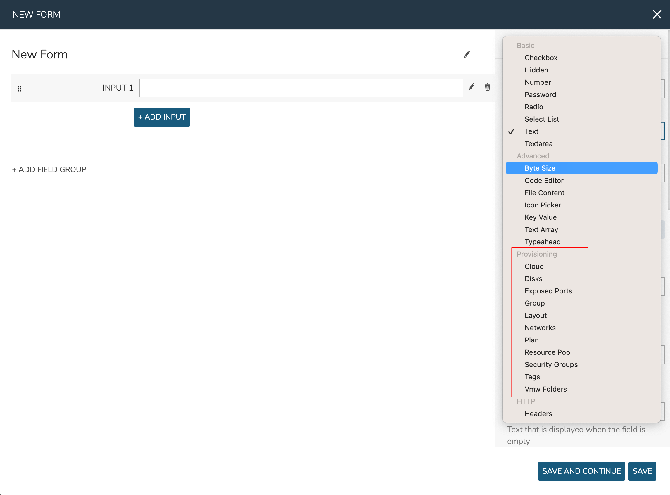
Inputs in the provisioning category are specifically tied to some provisioning construct in Morpheus (Groups, Clouds, etc.). They’re very useful for allowing users to select specific provisioning constructs, such as the Group, Cloud, Layout, or Network they wish to provision, and can automatically inject the user’s selection into the Catalog Item. This makes for much simpler Catalog Item development as compared to setting up the configuration using just the Input construct outside of Forms.
Provisioning Inputs also include relevant reload and filtering behaviors by default. For example, your Cloud Input field will automatically reload after making a Group selection or your Layout Input field will automatically reload after setting a Group, Cloud, and Instance Type. This makes it very easy to create flexible Catalog Item forms that are useful across Clouds.
The following provisioning Input types are supported, each with their own automatic filtering behavior and auto-inject capability into the Catalog Item spec:
Cloud
Disks
Exposed Ports
Group
Layout
Networks
Plan
Resource Pool
Security Groups
Tags
Vmw Folders
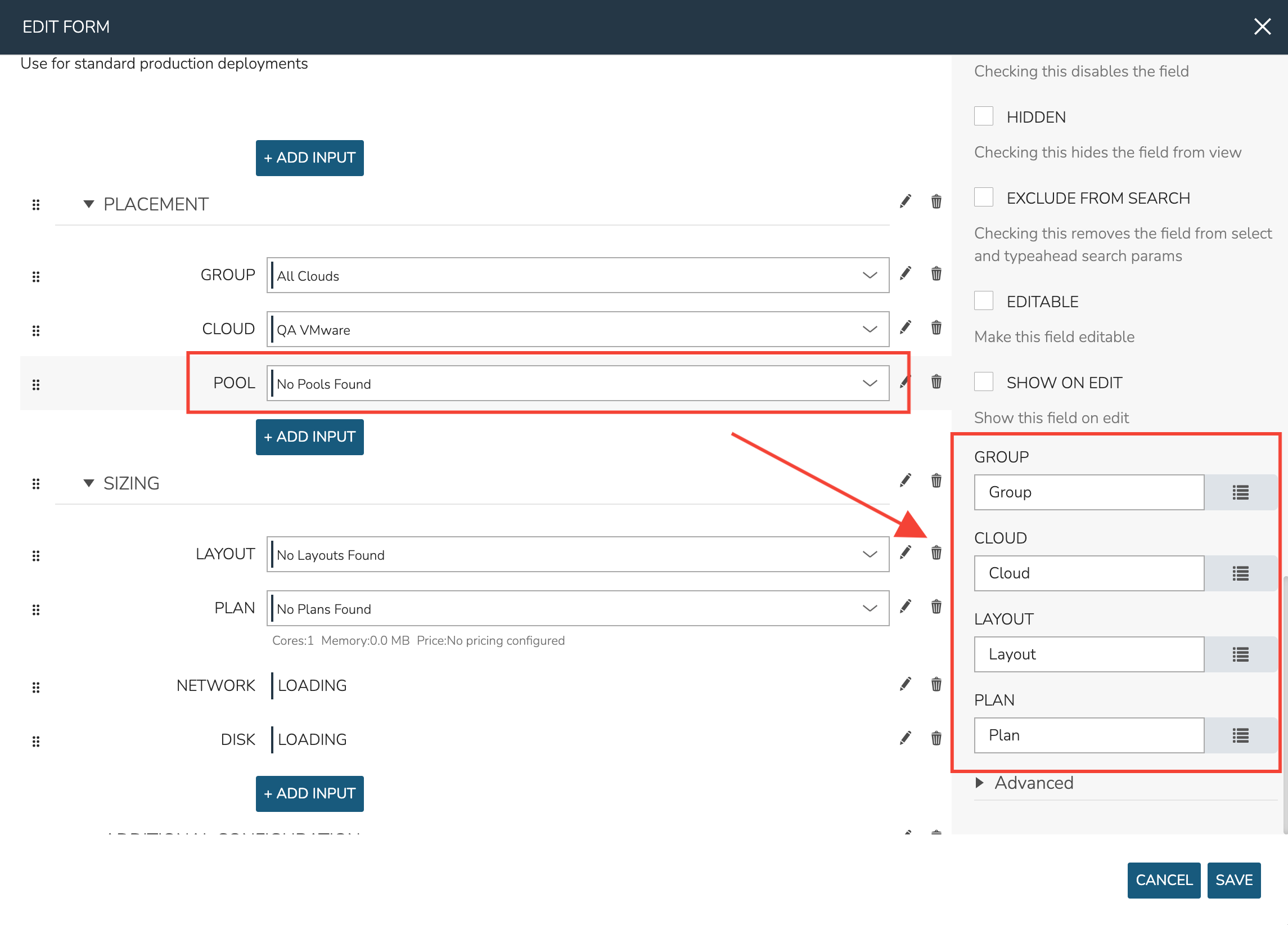
In order for provisioning Inputs to work properly, be sure to properly set the fields they should filter against. In the screenshot below you can see for a Resource Pool Input I’ve set the Group, Cloud, Layout, and Plan Inputs that it must be filtered against in order to work. Search for the Field Label of the target Input.
Once the type selected, the new Input will have many configuration options, most of which are the same options available when creating an Input from the Inputs section though some are new and some are presented in slightly different ways. The available options depend on the Input type selected but common options are shown in the expandable section below:
Common Input Configuration Options
- FIELD LABEL
The name and label of the Input
- LOCALIZED LABEL
If a localization code is selected, this field will have a translated label relative to the localization language selected for the appliance or user
- FIELD NAME
This is the Input fieldName property used to resolve the field value into code or to refer to this field for creating dynamic relationships with other Input fields
Note
Field names should only contain letters, numbers, and hyphen (-), underscore (_), or dot’.’ for separation.
- DEFAULT VALUE
Pre-populates field with a default value
- PLACEHOLDER
Background text that populates inside a field for adding example values, does not set a value
- HELP BLOCK
Helpful text that will appear under your Input field to inform users about their selection
- LOCALIZED HELP BLOCK
If a localization code is selected, this field will have a translated help block relative to the localization language selected for the appliance or user
- REQUIRED
Prevents User from proceeding without setting value
- EXPORT AS TAG
Creates Tags for fieldName/value (key/value) on Instances
- DISPLAY VALUE ON DETAILS
When selected, the Input label and value (label: value) will be visible in a list of custom options on the Instance detail page
- LOCKED
The Input field is visible but locked from being edited by the user. Any configured default values will be seen and set on the Instance but the user may not change the value
- HIDDEN
Hides the field from view. The field is still active, however, and any configured default value would still be set
- EXCLUDE FROM SEARCH
For Select List and Typeahead Inputs, check to exclude the form data from being stored as variables (which can be leveraged from an API call when needed)
- EDITABLE
Allow the Input value to be updated when editing an Instance (This attribute is hidden if SHOW ON EDIT is not selected)
- SHOW ON EDIT
Display the Input name and value when editing an Instance
- ALLOW MULTIPLE SELECTIONS
For certain Input types which support multiple selections (Select List and Typeahead, for example), check to allow multiple items to be selected
- DEPENDENT FIELD
The Field Name value for a field that will reload this Option List to present a different set of selections. Take a look at the section below on Cascading Inputs as well as the associated article in our KnowledgeBase for documented examples of this feature
- VISIBILITY FIELD
A Field Name and selection value that will trigger this field to become visible. Currently, this only works when the Input is associated with a Service Catalog Item and viewed from the Service Catalog Persona perspective. See the section below on the Visibility Field for instructions on configuring this value
- VERIFY PATTERN
For Text and Text Area-type Inputs. If desired, enter a regex pattern string and user entries must match the string to be accepted
- REQUIRE FIELD
A fieldName that will trigger required attribute of this option
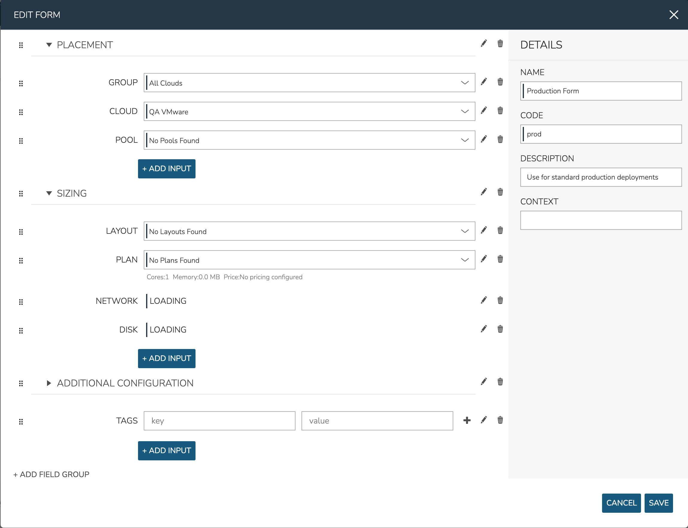
A complete example form making use of provisioning Inputs and Field Groups is shown below:
Turning Forms into Catalog Items
Once created, Forms can be associated with Catalog Items in the same way individual Inputs could before Forms were added. Add a new Catalog Items (or edit an existing one) in Library > Blueprints > Catalog Items. For complete details, refer to documentation on creating Catalog Items.
Inputs
Inputs are custom input fields that can be added to Instance Types and Layouts, then presented in Instance, App, and Cloning wizards. The resulting value is available in the Instance config map as <%=customOptions.fieldName%> or <%=customOptions[‘fieldName’], the latter syntax being required in certain situations such as when the field name contains a hyphen “-” (ex. <%=customOption[‘my-field-name’]). The fieldName and value can also be exported as Tags.
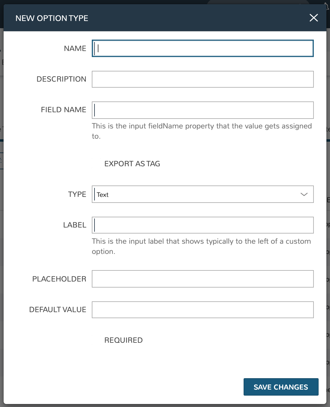
Create Input
Note
All possible fields listed. Displayed fields depend on TYPE selection
- NAME
Name of the Input
- DESCRIPTION
Description for reference in Input list view
- FIELD NAME
This is the input fieldName property that the value gets assigned to
Note
Field names should only contain letters, numbers, and hyphen (-), underscore (_), or dot’.’ for separation.
- EXPORT AS TAG
Creates Tags for fieldName/value (key/value) on Instances
- HIDDEN
When marked, this Input will be hidden from the user but the value will still be accessible. This allows for alternate Input types to be used as hidden Inputs than what is possible with “Hidden” type Inputs (described further below). This is also different from Input “Visibility” settings as the values of non-visible Inputs is not accessible for consumption in automation routines
- DEPENDENT FIELD
The Field Name value for a field that will reload this Option List to present a different set of selections. Take a look at the section below on Cascading Inputs as well as the associated article in our KnowledgeBase for documented examples of this feature
- VISIBILITY FIELD
A Field Name and selection value that will trigger this field to become visible. Currently, this only works when the Input is associated with a Service Catalog Item and viewed from the Service Catalog Persona perspective. See the section below on the Visibility Field for instructions on configuring this value. It should also be noted that when an Input is not visible, its value is not available for consumption in automation routines. Use the “Hidden” flag (see above) to configure hidden yet accessible values
- REQUIRE FIELD
A fieldName that will trigger required attribute of this option
- SHOW ON EDIT
Display the Input name and value when editing an Instance
- EDITABLE
Allow the Input value to be updated when editing an Instance (This attribute is hidden if SHOW ON EDIT is not selected)
- DISPLAY VALUE ON DETAILS
When selected, the Input label and value (label: value) will be visible in a list of custom options on the Instance detail page
- TYPE
Text: Text Input Field
Text Area: A text area input, when selected an additional option appears to allow the user to configure the default number of visible rows in the text area
Select List: Populated by Option Lists, presents a manual or REST-populated dropdown list
Checkbox: Checkbox for
onoroffvaluesNumber: Input field allowing only numbers
Typeahead: Populated by Option Lists: Rather than presenting a potentially-large dropdown menu, the user can begin typing a selection into a text field and choose the desired option. Multiple selections can be allowed with this type by marking the ‘ALLOW MULTIPLE SELECTIONS’ box
Hidden: No field will be displayed, but the field name and default value will be added to the Instance config map for reference
Password: An input field with suitable encryption for accepting passwords
Radio List: Populated by Option Lists, presents a selection of radio buttons for the provisioning user
- LABEL
This is the input label that typically shows to the left of a custom option
- ROWS
For
Textareatype Option Lists, determines how many text rows will be given when the Input is presented- PLACEHOLDER
Background text that populates inside a field for adding example values, does not set a value
- DEFAULT VALUE
Pre-populates field with a default value
- HELP BLOCK
Helpful text that will appear under your Input field to inform users about their selection
- REQUIRED
Prevents User from proceeding without setting value
- REMOVE NO SELECTION
For Select List-type Inputs. When marked, the Input will default to the first item in the list rather than to an empty selection. This is especially useful when only one choice is anticipated to be in the list as it saves the user from manually making a default selection
- VERIFY PATTERN
For Text and Text Area-type Inputs. If desired, enter a regex pattern string and user entries must match the string to be accepted
Verify Pattern Demo
- DEFAULT CHECKED
For
Checkboxtypes, when marked the Checkbox will be checked by default- OPTION LIST
For
Select Listtypes, select a pre-existing Option List to set dropdown valuesNote
Select ListandTypeaheadInputs require creation and association of an Option List
Cascading Inputs
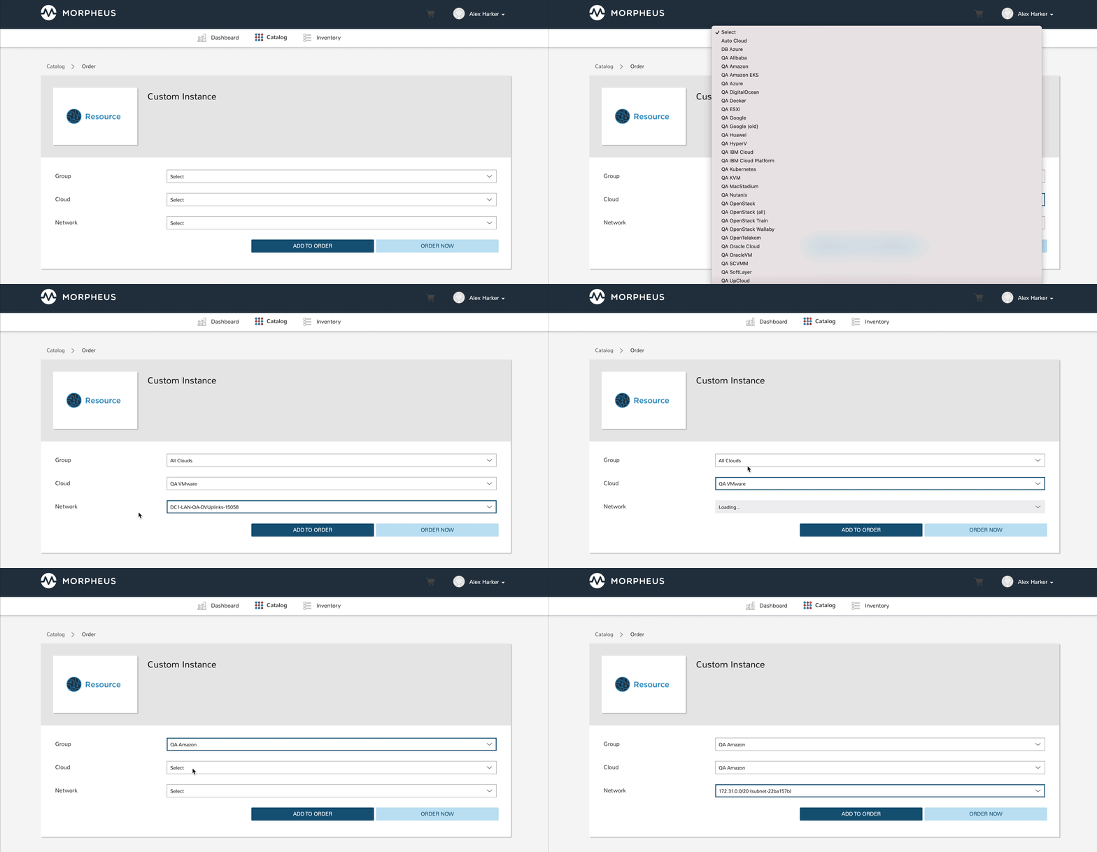
One powerful facet of Morpheus Inputs is the ability to present users with different lists of input options based on their selections in other Inputs within the same wizard or modal. One common example, which is fully illustrated in this section, is to have a user select:
The Group they wish to provision into…
Then select the target Cloud from a list limited to Clouds which are in the selected Group…
Then select the target network from a list limited to networks which are available to the selected Cloud and Group
To set this up, we will first configure our Inputs (custom option fields that can be applied to Instance Types and other Morpheus constructs) and Option Lists (dynamic lists of possible choices which can be associated with Inputs and presented in a dropdown or typeahead format). Once the custom options are configured, we will associate them with a new service catalog item and take a look at how the user would interact with them.
Group Custom Options
To begin, we will create a new Option List In this case, we will select type of “Morpheus Api” which will populate the list based on a call to the internal Morpheus API. Option Lists can also be populated by calls to external REST APIs or even from static lists that you enter manually. When dynamically populating Option Lists, whether via Morpheus API or an external API, translation and/or request scripts may be needed to prepare the request or translate the results. More on that as we build out the example.
I have called my Option List “Groups” and selected “Groups” from the OPTION LIST menu. This simply indicates that Groups are the construct we want to call into our list from Morpheus API. In this case, we want to present a list of all Groups to the user by their name and pass the Group database ID in the background. Since it is common to create Option Lists from Morpheus API where the construct name is displayed to the user and the ID is passed, we actually do not need to input any translation scripts in this case. However, I will include a translation script here which does the same thing simply to provide more clarity to the example. Morpheus Option List documentation includes additional details on available translation script inputs and which are available without translation as a convenience feature.
for (var x = 0; x < data.length; x++) {
  results.push({name: data[x].name, value:data[x].id});
}
After saving the Option List, create the Input that presents the list we just created. I gave my Input the name of “Selected Group”, field name of “selectedGroup”, and label of “Group”. For type, choose “Select List” and a new field will appear at the bottom of the modal where we can select the Option List we just created. With this configuration, the Input will present as a dropdown list containing the options called from our Option List.
Cloud Custom Options
Adding the Option List and Input for Clouds will be similar to the prior step with the exception that we will be including a request script which effectively filters the list of available Clouds to only those associated with the selected group. Follow the same process to start a new Option List, I have configured mine as follows:
NAME: Parsed Clouds
TYPE: Morpheus Api
OPTION LIST: Clouds
We also need a request script that loads the siteId attribute of the results variable with the Group ID if the user has made a group selection. Essentially it appends this input as a query parameter to the API call, calling (for example) ./api/clouds?siteId=1 rather than .../api/clouds. It should be similar to the script below. Note that we are referencing the selectedGroup field name we created previously and that a “site” is the term for Groups in the Morpheus database.
if (input.selectedGroup) {
  results.siteId = input.selectedGroup
}
We also need a translation script which will be identical to the one used previously with the exception that if there is no input on the selectedGroups field, nothing will be displayed for the Clouds option.
if (input.selectedGroup) {
for (var x = 0; x < data.length; x++) {
    results.push({name:data[x].name, value:data[x].id});
  }
}
We also need to create an Input to house this Option List. This process will be very similar to creating the previous Input except that we need to set selectedGroup as the Dependent Field. Setting a dependent field on an Input will trigger it to reload each time a selection is made in the indicated option. My configuration is as follows:
NAME: Parsed Cloud
FIELD NAME: parsedCloud
DEPENDENT FIELD: selectedGroup
TYPE: Select List
LABEL: Cloud
OPTION LIST: Parsed Clouds
Save your changes once done.
Network Custom Option
Finally, we will create an Option List/Input pair for network selection. In this case, it will be dependent on both the Group and Cloud selection. My Option List configuration is below:
NAME: Parsed Networks
TYPE: Morpheus Api
OPTION LIST: Networks
Request Script:
if (input.parsedCloud && input.selectedGroup) {
  results.cloudId = input.parsedCloud
  results.groupId = input.selectedGroup
}
Translation Script:
if (input.parsedCloud && input.selectedGroup) {
for (var x = 0; x < data.length; x++) {
    results.push({name:data[x].name, value:data[x].id});
  }
}
The Input is configured as follows:
NAME: Parsed Networks
FIELD NAME: parsedNetwork
DEPENDENT FIELD: parsedCloud
TYPE: Select List
LABEL: Network
OPTION LIST: Parsed Networks
Setting Custom Options at Provision Time
At this point, our dependent options are ready to be applied to custom Instance Types, Workflows or Service Catalog items as needed. When creating them, we can select an unlimited number of Inputs from a typeahead field on the create modal and they will be presented when a user goes to provision that element or run that Workflow. As an example, I have created a Service Catalog item that incorporates the three Inputs we have created. You can see how the dependent fields reload and present different options based on my selections.
Visibility Field
The Input Visibility field allows users to set conditions under which the Input field is displayed. Visibility field accepts fieldName:value or fieldName:(regex), where “fieldName” equals the fieldName of another Input which will determine the visibility of this Input, and “value” equals the target value of the other Input (or a regex pattern that matches to the values that meet your desired conditions). You can simply enter “fieldName” when visibility should be triggered when any value is entered. When the value of the target Input matches the “value” or “(regex)” set in the Visibility field, this Input will be displayed. When the value of the target Input does not match “value” or satisfy the “(regex)” set in the Visibility field, this Input will not be displayed.
Expanding on the simplified example above, we could trigger visibility based on any one of multiple selections from the same Input by using a different regular expression, such as color:(red|blue|yellow). Additionally, we are not restricted to the conditions of just one Input to determine visibility as the following would also be valid: color:(red|blue|yellow),shape:(square). In the previous example, the Input “Color” would have to be set to red, blue, or yellow OR the Input “Shape” would have to be set to square in order to trigger visibility of the Input currently being configured. Prepend the previous example with matchAll:: in order to require both conditions to be met rather than one or the other (ex. matchAll::color:(red|blue|yellow),shape:(square)).
Required Field
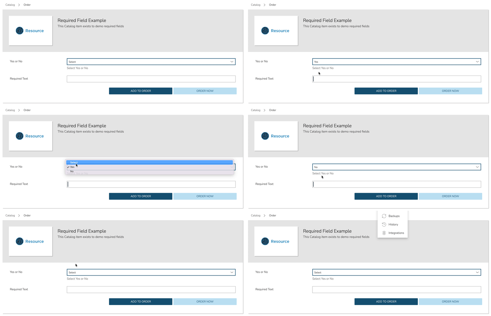
The Required field allows for Inputs to be conditionally required. In this field, enter the Field Name value for another Input and, if that Input is filled by the user, the current Input will become required. This feature could also be used in conjunction with the Visibility field described above in that you may want a field to be required when visible but not required when hidden. Below is a simple abstract example showing how the second displayed Input becomes required when the first displayed Input is filled.
Option Lists
Option Lists allow you to give the user more choices during provisioning to then be passed to scripts and/or automation. Option Lists, however, are pre-defined insofar as they are not free-form. They can be manually entered CSV or JSON, they can be dynamically compiled from REST calls via GET or POST requests, or populated by LDAP queries.
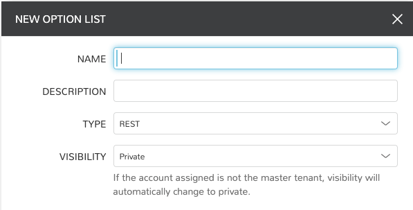
Generic Option List Fields
The displayed fields in the create/edit Option List modal depend on the TYPE value selected.
- NAME
Name of the Option List
- DESCRIPTION
Description of the Option List for reference in Option List list view
- TYPE
REST: REST API call to populate Option List
Manual: Manually entered dataset, CSV or JSON
Morpheus API: Call to internal Morpheus API to populate the Option List
LDAP: Searches and returns a list of Active Directory objects
Plugin: Sourced by custom-coded
DataSetProviderplugins. See developer documentation for additional details
- VISIBILITY
If the account currently signed in is not in the master tenant, visibility will automatically change to private
Manual Option List Fields
- DATASET
Appears only for manual Option Lists. Add your CSV or JSON list to this field
Note
JSON entries must be formatted like the following example:
[{"name":"Test","value":1},{"name":"Testing","value":2}]
Plugin Option List Fields
- OPTION LIST
Select an Option List made available by a currently-integrated plugins
REST Option List Fields
- SOURCE URL
A REST URL used to fetch list data which is cached in the appliance database
- REAL TIME
When checked, a REST call will be made to update the Option List at the time its presented to the User
- IGNORE SSL ERRORS
Do not fail API query for self-signed or invalid certs on REST call target
- SOURCE METHOD
GET or POST
- SOURCE HEADERS
Custom HTTP Headers to include in the source request
- CREDENTIALS
Use a stored credential set or manually enter credentials to access data requiring authentication. Currently, only basic auth is supported
- INITIAL DATASET
Create an initial JSON or CSV dataset to be used as the collection for this option list. It should be a list containing objects with properties ‘name’ and ‘value’
- TRANSLATION SCRIPT
Create a JS script to translate the result data object into an array containing objects with properties ‘name’ and ‘value’. The input data is provided as ‘data’ and the result should be put on the global variable ‘results’.
Example:
for(var x=0;x < data.length; x++) {
  results.push({name: data[x].name,value:data[x].id});
}
- REQUEST SCRIPT
Create a JS script to prepare the request. Return a data object as the body for a POST request, and return an array containing properties ‘name’ and ‘value’ for a GET request. The input data is provided as ‘data’ and the result should be put on the global variable ‘results’
Example:
results.push({name: 'userId', value : data.users})
In a GET request (SOURCE METHOD = GET), the value of the results variable is used to build out the request parameters. Thus, in the example
resultsvalue:results=[{name:"name1",value: "value1"}]
The request would be made to:
https://<someURL>?name1=value1.In a POST request (SOURCE METHOD = POST), the value of the results variable is used to build the body of the POST request. Thus, in the example
resultsvalue:results=[{name:"name1", value:"value1"}, {name:"name2", value:"value2"}]
The following JSON body would be posted to the target URL:
{name:"name1", value:"value1"}, {name:"name2", value:"value2"}
An alternative method to building the POST request (SOURCE METHOD = POST), can be seen below. As well, we can access other Inputs that are available on the same form, when provisioning an Instance or Catalog Item. As seen below, the other Inputs can be accessed using the
datavariable. We can access another Input by calling its Field Name, which can be configured when editing the Input in Library > Options > Inputs. This allows using data from other Inputs to be used in this Input’s request.In the example below the Input Field Name we’ll access is
myinputfieldname, which we can get either the name (visible value for lists) or value from the item:Name variable:
data.myinputfieldnameValue variable:data.myinputfieldname_valuevar postBody = {}; postBody["number"] = data.myinputfieldname_value; postBody["env"] = "all"; results = postBody;
The following JSON body would be posted to the target URL:
{ "number": "123456", "env": "all" }
Morpheus API Option List Fields
- OPTION LIST
A list of available object types to return
- TRANSLATION SCRIPT
Create a JS script to translate the result data object into an array containing objects with properties ‘name’ and ‘value’. The input data is provided as ‘data’ and the result should be put on the global variable ‘results’.
Example:
var i=0;
results = [];
for(i; i<data.length; i++) {
  results.push({name: data[i].name, value: data[i].value});
}
Translation script inputs:
Clouds
id: <Number>value: <Number>// id, conveniencename: <String>code: <String>description: <String>regionCode: <String>location: <String>zoneType: <Object>id: <Number>name: <String>cloud: <String>// “public” or “private” valuecode: <String>
Environments
id: <Number>value: <Number>// id, convenience attribute to avoid requiring translationcode: <String>name: <String>
Groups
id: <Number>value: <Number>// id, convenience attribute to avoid requiring translationname: <String>code: <String>uuid: <String>location: <String>datacenterId: <Number>
Instances
id: <Number>value: <Number>// id, conveniencename: <String>displayName: <String>category: <String>description: <String>apiKey: <String>status: <String>hourlyPrice: <Number>hourlyCost: <Number>instanceType: <Object>id: <Number>name: <String>
plan: <Object>id: <Number>name: <String>
site: <Object>id: <Number>name: <String>
Instances Wiki
id: <Number>value: <Number>// id, conveniencename: <String>urlName: <String>category: <String>instanceId: <String>content: <String>contentFormatted: <String>format: <String>createdByUsername: <String>updatedByUsername: <String>
Networks
id: <Number>value: <Number>// id, conveniencecode: <String>category: <String>name: <String>status: <String>cloudId: <Number>groupId: <Number>networkType:<Object>id: <Number>code: <String>name: <String>
externalId: <String>externalNetworkType: <String>networkDomain: <Object>id: <Number>name: <String>
networkPool: <Object>id: <Number>name: <String>
createdBy: <String>
Plans
id: <Number>value: <Number>// id, conveniencecode: <String>name: <String>storage: <Integer, bytes>memory: <Integer, bytes>cores: <Number>
Resource Pools
id: <Number>value: <Number>// id, conveniencecode: <String>externalId: <String>name: <String>serverGroupId: <Number>status: <String>regionCode: <String>parentPoolId: <Number>type: <String>
Security Groups
id: <Number>value: <Number>// id, conveniencecode: <String>name: <String>externalType: <String>externalId: <String>cloudId: <Number>scopeMode: <String>scopeId: <Number>
Servers
id: <Number>value: <Number>// id, conveniencename: <String>displayName: <String>description: <String>category: <String>osType: <String>powerState: <String>lastStats: <String>zone: <Object>id: <Number>name: <String>
capacityInfo: <Object>maxStorage: <Integer, bytes>maxMemory: <Integer, bytes>maxCores: <Number>usedMemory: <Integer, bytes>usedStorage: <Integer, bytes>
computeServerType: <Object>id: <Number>name: <String>nodeType: <String>vmHypervisor: <String>containerHypervisor: <String>
Servers Wiki
id: <Number>value: <Number>// id, conveniencename: <String>urlName: <String>category: <String>serverId: <String>content: <String>contentFormatted: <String>format: <String>createdByUsername: <String>updatedByUsername: <String>
- REQUEST SCRIPT
The request script is used differently for Morpheus API Option List types. A Morpheus API option list type will use an internal API to return a list of objects instead of performing HTTP(S) requests to the Morpheus API. Due to this approach, the results object will not be used to generate query parameters or a JSON body. The results object will instead be used to contain a map of accepted key:value pairs that can be used to filter, sort and order the list of objects that get returned.
Below is a list of accepted
key:valuepairs for each object type:Generic options available for all object types
max: <integer>// Maximum number of results to return. Default: 25offset: <integer>// Offset for returned results. Default: 0sort: <string>// Field to sort on. Default: ‘name’order: <string>// Order of returned values. Accepted values: ‘asc’, ‘desc’. Default: ‘asc’Example:
results = {max: 5, order : 'desc'}
Networks
zoneIdsiteIdplanIdprovisionTypeId: <Number>// Id of the provision type (technology), filters to only networks associated with this provision typelayoutId: <Number>// Id of an Instance Layout, ignored if provisionTypeId is supplied, otherwise used to look up the provision typepoolId: <Number>// Id of a network pool, filters to only networks within the specified network pool
Instance Networks
- Contains same options for Networks Morpheus API but pre-filtered for Networks applicable to a selected Instance Type.
phrase : <string>// Fuzzy matches phrase on wiki name, urlName and content
Plans
zoneIdsiteIdlayoutIdprovisionTypeId: <Number>// Id of the provision type (technology), filters to only plans associated with this provision type
Resource Pools
zoneIdsiteIdplanIdlayoutId: <Number>// Id of an Instance Layout, used to get the associated provision type and filter to that provision type
Security Groups
zoneId// requiredpoolId
Clouds
zoneId : <integer>// Database ID of cloud to returntenantId : <integer>// Database ID of tenant where clouds are added. Filters to only clouds added within the specified tenant. Only available in Master TenantzoneTypeId : <integer>// Database ID of cloud type. Filters to only clouds with the specified cloud typesiteId : <integer>// Database ID of group. Filters to only clouds within the specified grouptagName : <string>// Filters to clouds with servers with tags containing the tagNametagValue : <mixed>// Requires tagName. Filters to clouds with servers that have tags containing the tagName and specified tagValuephrase : <string>// Fuzzy matches phrase on cloud name and descriptionExample:
results = {tenantId: 1, siteId: 1, tagName: "morpheus"}
Instance Types Clouds
- Contains same options for Clouds Morpheus API type but pre-filtered for Clouds applicable to a selected Instance Type.
phrase : <string>// Fuzzy matches phrase on wiki name, urlName and content
Instances
appsId : <integer>// Database ID of app to filter by. Returns instances linked to the apptenantId : <integer>// Database ID of tenant where instances are located. Filters to only instances within the specified tenant. Only available in Master TenantserverId : <integer>// Database ID of server. Filters to the instance that contains the specified servertagName : <string>// Filters to instances with tags containing the tagNametagValue : <mixed>// Requires tagName. Filters to instances with tags containing the tagName and specified tagValuephrase : <string>// Fuzzy matches phrase on instance name and descriptionExample:
results = {tenantId:1, phrase: "ha"}
Groups
tenantId : <integer>// Database ID of tenant where groups are located. Filters to only groups added within the specified tenant. Only available in Master TenantzoneTypeId : <integer>Database ID of cloud type. Filters to only groups that contain clouds with the specified cloud typezoneId : <integer>// Database ID of cloud. Filters to only groups that contain the cloud with the specified IDsiteId : <integer>// Database ID of group to returnphrase : <string>// Fuzzy matches phrase on group name and location.
Servers
tenantId : <integer>// Database ID of tenant where servers are located. Filters to only servers within the specified tenant. Only available in Master TenantserverId : <integer>// Database ID of server. Filters to the server specified by the IDsiteZoneId : <integer>// Database ID of cloud. Filters to servers contained within the specified cloudserverType : <string>// Type of server. Accepted values: ‘host’, ‘baremetal’, ‘vm’siteId : <integer>// Database ID of group. Filters to only servers contained within clouds that are added in the specified grouptagName : <string>// Filters to servers with tags containing the tagNametagValue : <mixed>// Requires tagName. Filters to servers with tags containing the tagName and specified tagValuephrase : <string>// Fuzzy matches phrase on server name and description.Example:
results = {max: 50, siteZoneId : 3}
Instances Wiki
- Contains same options for Instances Morpheus API type.
phrase : <string>// Fuzzy matches phrase on wiki name, urlName and content
Servers Wiki
- Contains same options for Servers Morpheus API type.
phrase : <string>// Fuzzy matches phrase on wiki name, urlName and content
LDAP Option List Fields
- LDAP URL
The URL pointing to the LDAP server
- USERNAME
The fully qualified username (with @ suffix syntax) for the binding account
- PASSWORD
The password for the above account
- LDAP Query
The LDAP query to pull the appropriate objects. See the next section for an example use case
- TRANSLATION SCRIPT
Create a JS script to translate the result data object into an array containing objects with properties ‘name’ and ‘value’. The input data is provided as ‘data’ and the result should be put on the global variable ‘results’.
Note
Option Lists are set on one or multiple Select List or Typeahead Inputs. The Input is then set on an Instance Type, Layout, Cluster Layout, and/or Operational Workflow for input during provisioning or execution.
LDAP Query Variables
The current user and dependant parameters are loaded into the query using the <%=phrase%> syntax.
 user {
    accountId,
    attributes,
    displayName,
    email,
    firstName,
    id,
    lastName,
    linuxUsername,
    username,
    windowsUsername
 }
 customOptions {
    fieldName
 }
Creating an Option List Based on an LDAP Query
In Morpheus version 4.2.1 and higher, Option Lists can be populated from LDAP queries. This gives users the ability to search Active Directory, capture objects, and present them as custom options where needed.
It’s recommended that you connect LDAP-type Option Lists to Typeahead-type Inputs as the list of returned selections can be very large. This also allows you to select multiple options from the list, presuming you’ve allowed for that when creating the Input.
Populating LDAP-type Option Lists requires knowledge of LDAP query syntax. This guide provides one example and there are many publicly-available resources for help writing additional queries.
Create a new Option List (Library > Options > Option Lists > ADD)
Enter a name for the new LDAP Option List
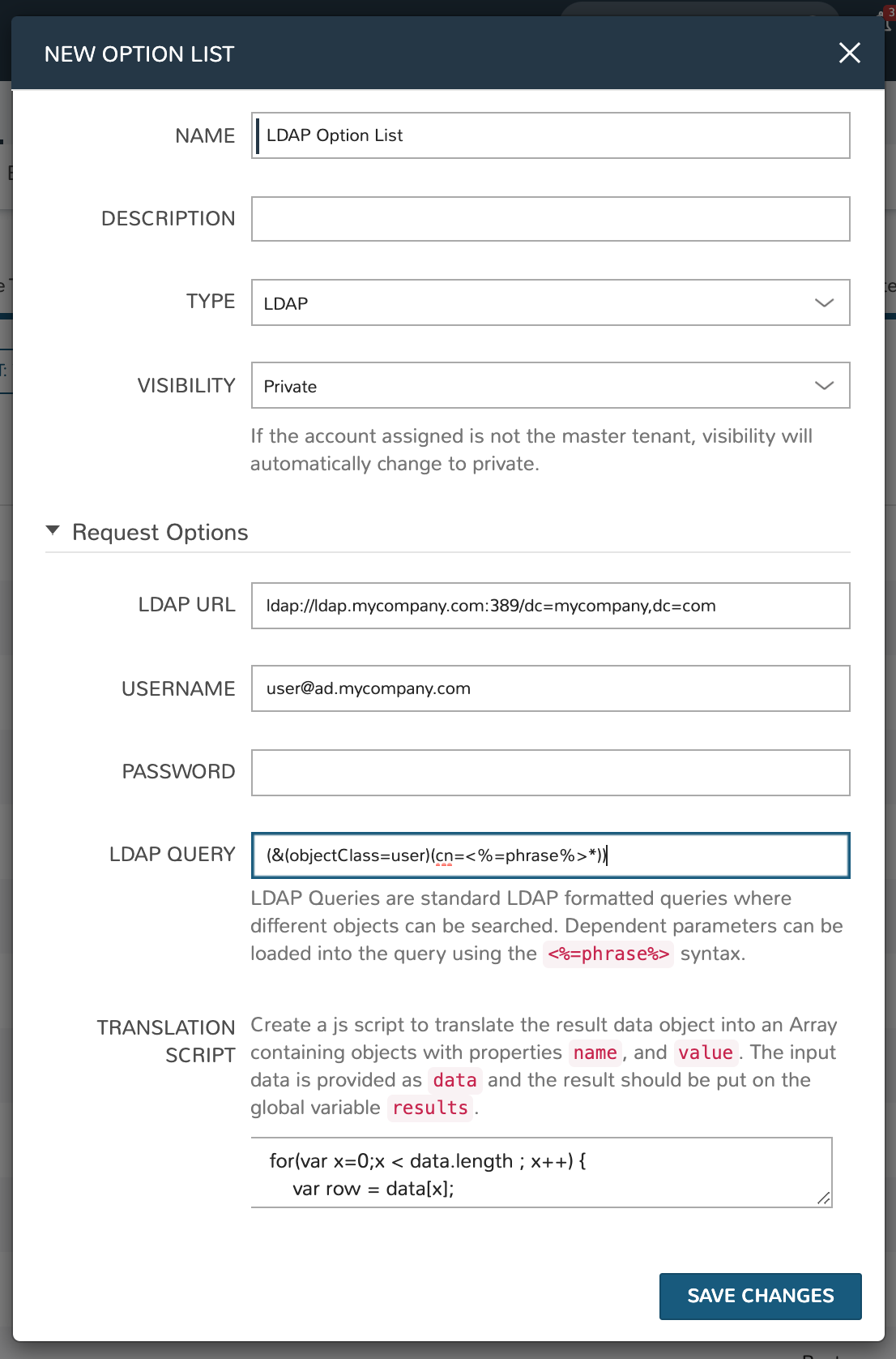
Change the Type value to LDAP and the relevant fields will appear as shown in the screenshot:
Enter the LDAP URL in the following format (an example is also shown as a placeholder in the UI form field):
ldap[s]://<hostname>:<port>/<base_dn>
Enter the fully qualified username with @ suffix syntax, such as: user@ad.mycompany.com
Enter the account password
Enter your LDAP query. You can even inject variables into your query structure to query based on the value the user has entered into the typeahead field as shown in the example below:
(&(objectClass=user)(cn=<%=phrase%>*))
Finally, enter a translation script which will convert the returned LDAP object into a list of name:value pairs you can work with in Morpheus. The example script below shows the user DisplayName and sets the value to the SAMAccountName:
for(var x=0;x < data.length ; x++) {

  var row = data[x];
  var a = {};

  if(row.displayName != null) {
    a['name'] = row.displayName;

  } else {

    a['name'] = row.sAMAccountName;

  }

  a['value'] = row.sAMAccountName;
  results.push(a);

}
Click SAVE CHANGES
