Forms
Forms are designed to be used with Catalog Items. Using the provided tools, build forms to provide the appropriate customization fields for endusers in the Provisioning Catalog. Catalog Items can also be built using HPE Morpheus Enterprise Inputs but Forms provide unique capabilities that open up additional functionality and simplify the process. Once a Form is created it is then available to be associated with a Catalog Item. This section discusses the creation of Forms, the available options, and how they can be used effectively to create Catalog Items.
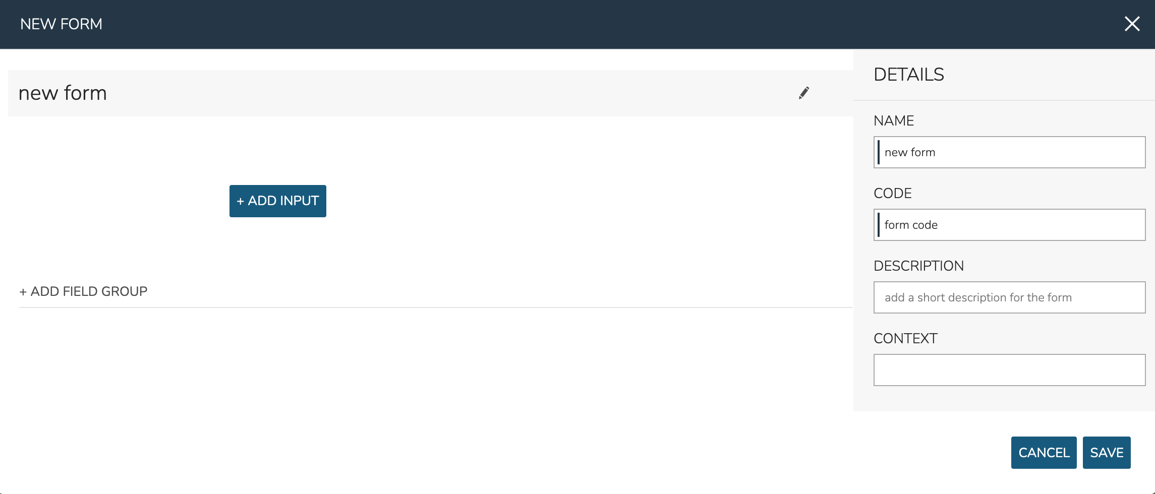
Adding Field Groups
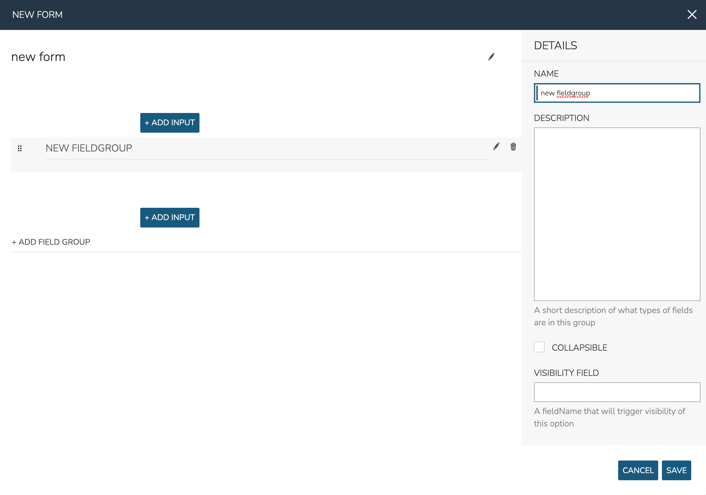
Field Groups are logical groupings of Input fields on your Form. Especially with larger forms, they make the Form easier to read and use. You can even collapse down sections of less commonly needed Inputs to keep your Forms clean. By default a new Form has no Field Groups but one can be added by clicking “+ ADD FIELD GROUP” in the center of the NEW FORM modal (which can be seen in the screenshot above). Field Groups can accept the following options:
NAME: The name and label for the Field Group
DESCRIPTION: And optional description for the Field Group
COLLAPSIBLE: When marked, the user can collapse (hide) or show the Field Group
COLLAPSIBLE BY DEFAULT: If the Field Group is marked collapsible, this option will appear to make the Field Group shown (unchecked) or hidden (checked) by default
VISIBILITY FIELD: Enter the fieldName of another Input and this Field Group will appear only when that Input has a value
Adding Inputs
Inputs are the Form options themselves and can take various forms, such as text fields, checkboxes, select lists or other custom forms. Inputs can be added outside of any created Field Groups or they may be added within them. Click + ADD INPUT within the desired area (inside a Field Group or outside of them).
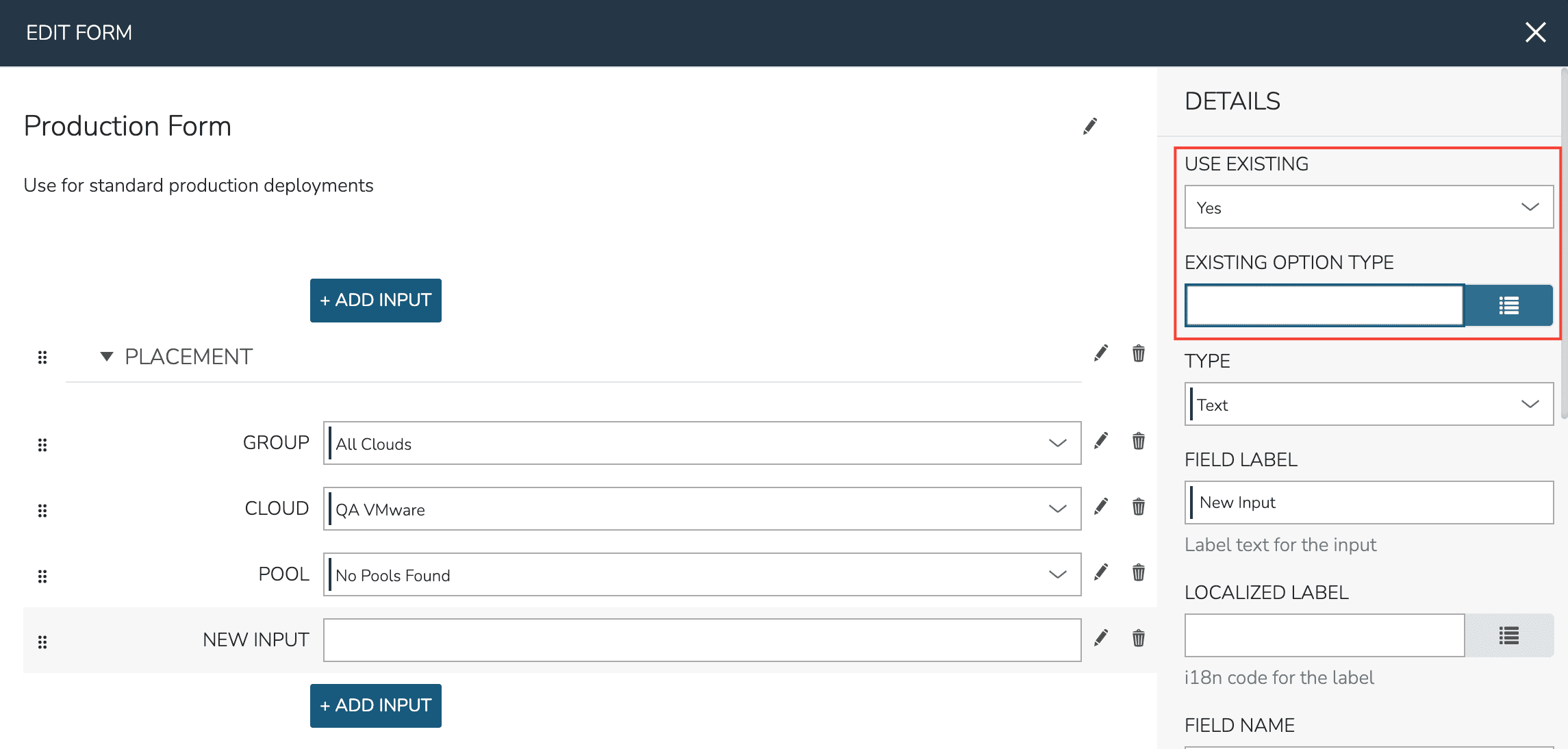
When adding Inputs, you may add any Input (Library > Options > Inputs) that is pre-existing to your form. Set “USE EXISTING” to “Yes” and make the selection from the “EXISTING OPTION TYPE” typeahead field. Once selected, you’ll notice that all other settings cannot be edited. If needed, edit this Input within the Inputs section (Library > Options > Inputs).
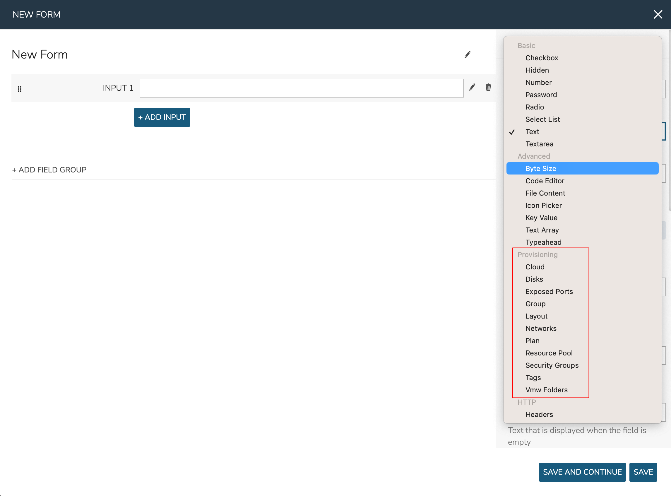
When adding Inputs, you may also create new Inputs within the Form builder. Some available types are no different than other Inputs you might make in the Input section (Library > Options > Inputs) but other types are unique to Forms. To create a new Input, set “USE EXISTING” to “No” and select the desired type.
Input types are organized by categories. Inputs in the basic category are primarily the same types of Inputs that can be made in the Inputs section (Library > Options > Inputs). These include text fields, select lists, checkbox arrays, numerical inputs, and more. You can read more about the basic Input types in HPE Morpheus Enterprise Input documentation.
Inputs in the Advanced and Provisioning categories are unique to Forms and require additional explanation. Advanced inputs are similar to basic but provide some sort of data manipulation capability or have a specific targeted function. See the list of advanced Input types below:
Byte Size: Allows numerical disk or storage size values to be given with selectable units (MB, GB, etc.). When a value is input and the unit is changed, the same value will be automatically computed into the new unit amount (1 GB > 1024 MB, for example). Users may select which unit is initially loaded by default.
Code Editor: Gives the user a code editor field. Set a language or markdown format in the “HIGHLIGHTING” field to enable automatic syntax highlighting and spacing for the user. For example, the user could enter a provisioning shell script for their workload or provide a custom JSON payload at provision time (complete with syntax highlighting for easy entry).
File Content: Access file content either locally entered or sourced from an integrated repository or outside URL
Icon Picker: Allows the user to select an icon for their workload at provision time. The user may select from previously uploaded icons, upload their own, or use the built-in icon generator tool to create a unique icon right in the Form
Key Value: Allows the user to enter as many key/value pairs as they’d like which can be onboarded into the workload config at provision time
Text Array: Allows the user to enter multiple values separated by a delimiter of your choosing. HPE Morpheus Enterprise will parse out the entered values which can be individually deleted if desired before the form is submitted
Typeahead: Similar to Select List, especially for very long lists. Search for the desired value by typing the first few letters as a search parameter. Users may also browse the complete list by clicking the dropdown icon. This Input type can also support multiple selections, if needed. Associate this type of Input with a pre-defined Option List or create a new Option List right inside the Form builder
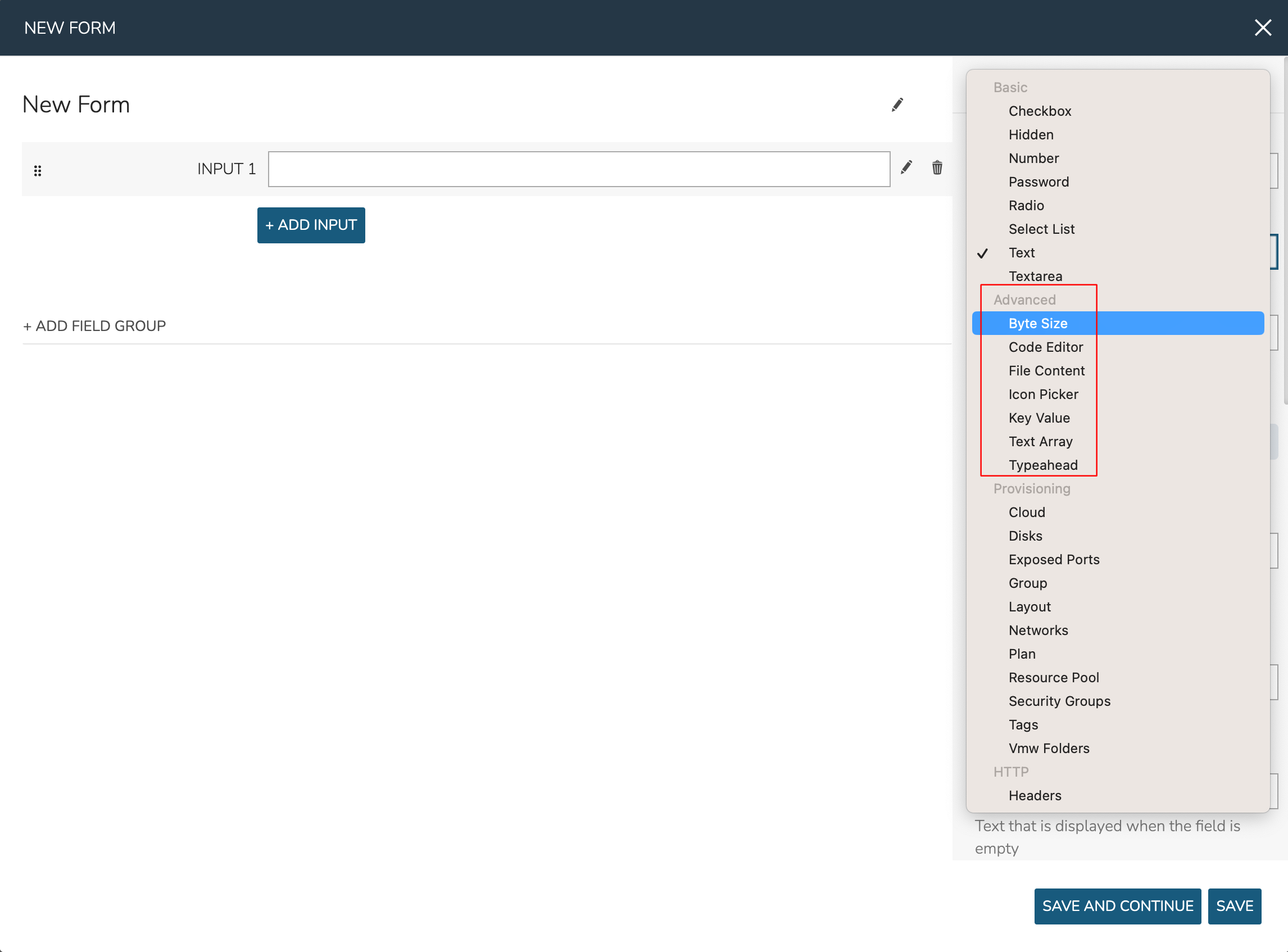
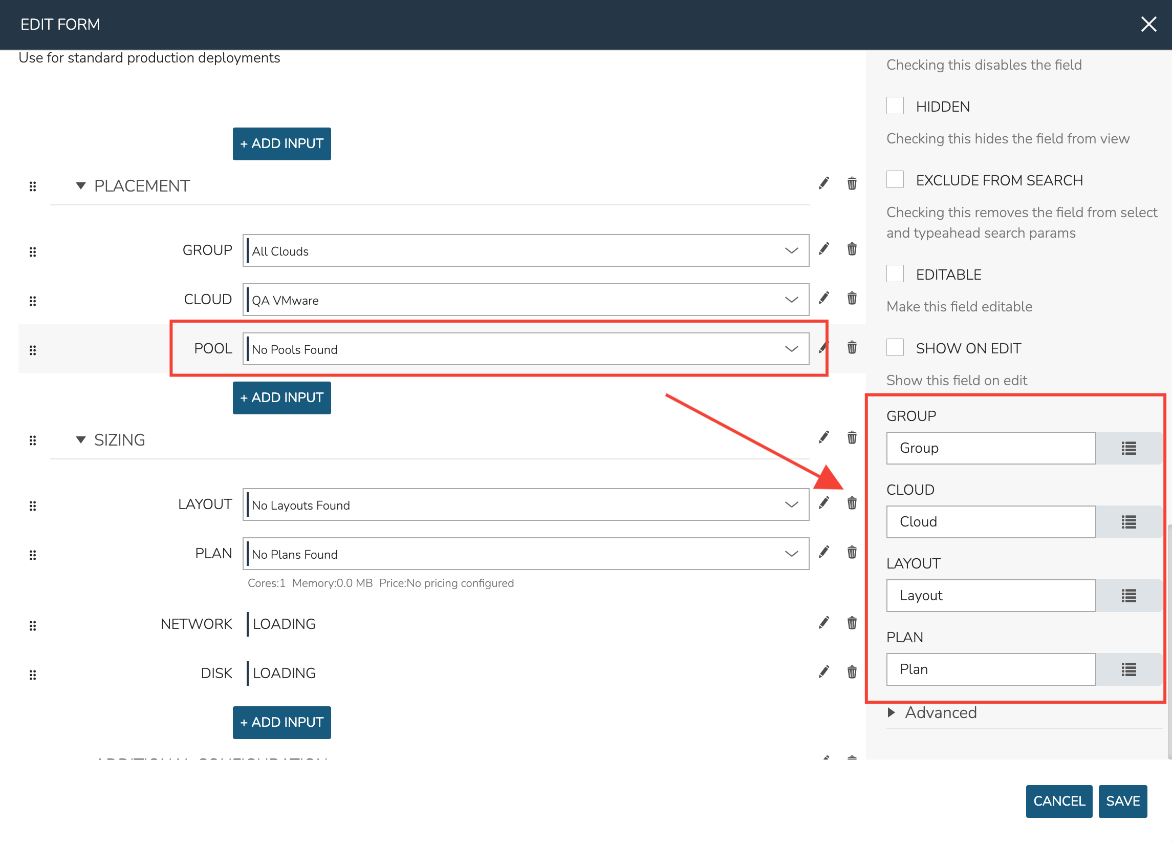
Inputs in the provisioning category are specifically tied to some provisioning construct in HPE Morpheus Enterprise (Groups, Clouds, etc.). They’re very useful for allowing users to select specific provisioning constructs, such as the Group, Cloud, Layout, or Network they wish to provision, and can automatically inject the user’s selection into the Catalog Item. This makes for much simpler Catalog Item development as compared to setting up the configuration using just the Input construct outside of Forms.
Provisioning Inputs also include relevant reload and filtering behaviors by default. For example, your Cloud Input field will automatically reload after making a Group selection or your Layout Input field will automatically reload after setting a Group, Cloud, and Instance Type. This makes it very easy to create flexible Catalog Item forms that are useful across Clouds.
The following provisioning Input types are supported, each with their own automatic filtering behavior and auto-inject capability into the Catalog Item spec:
Cloud
Disks
Exposed Ports
Group
Layout
Networks
Plan
Resource Pool
Security Groups
Tags
Vmw Folders
In order for provisioning Inputs to work properly, be sure to properly set the fields they should filter against. In the screenshot below you can see for a Resource Pool Input I’ve set the Group, Cloud, Layout, and Plan Inputs that it must be filtered against in order to work. Search for the Field Label of the target Input.
Once the type selected, the new Input will have many configuration options, most of which are the same options available when creating an Input from the Inputs section though some are new and some are presented in slightly different ways. The available options depend on the Input type selected but common options are shown in the expandable section below:
Common Input Configuration Options
- FIELD LABEL
The name and label of the Input
- LOCALIZED LABEL
If a localization code is selected, this field will have a translated label relative to the localization language selected for the appliance or user
- FIELD NAME
This is the Input fieldName property used to resolve the field value into code or to refer to this field for creating dynamic relationships with other Input fields
Note
Field names should only contain letters, numbers, and hyphen (-), underscore (_), or dot’.’ for separation.
- DEFAULT VALUE
Pre-populates field with a default value
- PLACEHOLDER
Background text that populates inside a field for adding example values, does not set a value
- HELP BLOCK
Helpful text that will appear under your Input field to inform users about their selection
- LOCALIZED HELP BLOCK
If a localization code is selected, this field will have a translated help block relative to the localization language selected for the appliance or user
- REQUIRED
Prevents User from proceeding without setting value
- EXPORT AS TAG
Creates Tags for fieldName/value (key/value) on Instances
- DISPLAY VALUE ON DETAILS
When selected, the Input label and value (label: value) will be visible in a list of custom options on the Instance detail page
- LOCKED
The Input field is visible but locked from being edited by the user. Any configured default values will be seen and set on the Instance but the user may not change the value
- HIDDEN
Hides the field from view. The field is still active, however, and any configured default value would still be set
- EXCLUDE FROM SEARCH
For Select List and Typeahead Inputs, check to exclude the form data from being stored as variables (which can be leveraged from an API call when needed)
- EDITABLE
Allow the Input value to be updated when editing an Instance (This attribute is hidden if SHOW ON EDIT is not selected)
- SHOW ON EDIT
Display the Input name and value when editing an Instance
- ALLOW MULTIPLE SELECTIONS
For certain Input types which support multiple selections (Select List and Typeahead, for example), check to allow multiple items to be selected
- DEPENDENT FIELD
The Field Name value for a field that will reload this Option List to present a different set of selections. Take a look at the section below on Cascading Inputs as well as the associated article in our KnowledgeBase for documented examples of this feature
- VISIBILITY FIELD
A Field Name and selection value that will trigger this field to become visible. Currently, this only works when the Input is associated with a Service Catalog Item and viewed from the Service Catalog Persona perspective. See the section below on the Visibility Field for instructions on configuring this value
- VERIFY PATTERN
For Text and Text Area-type Inputs. If desired, enter a regex pattern string and user entries must match the string to be accepted
- REQUIRE FIELD
A fieldName that will trigger required attribute of this option
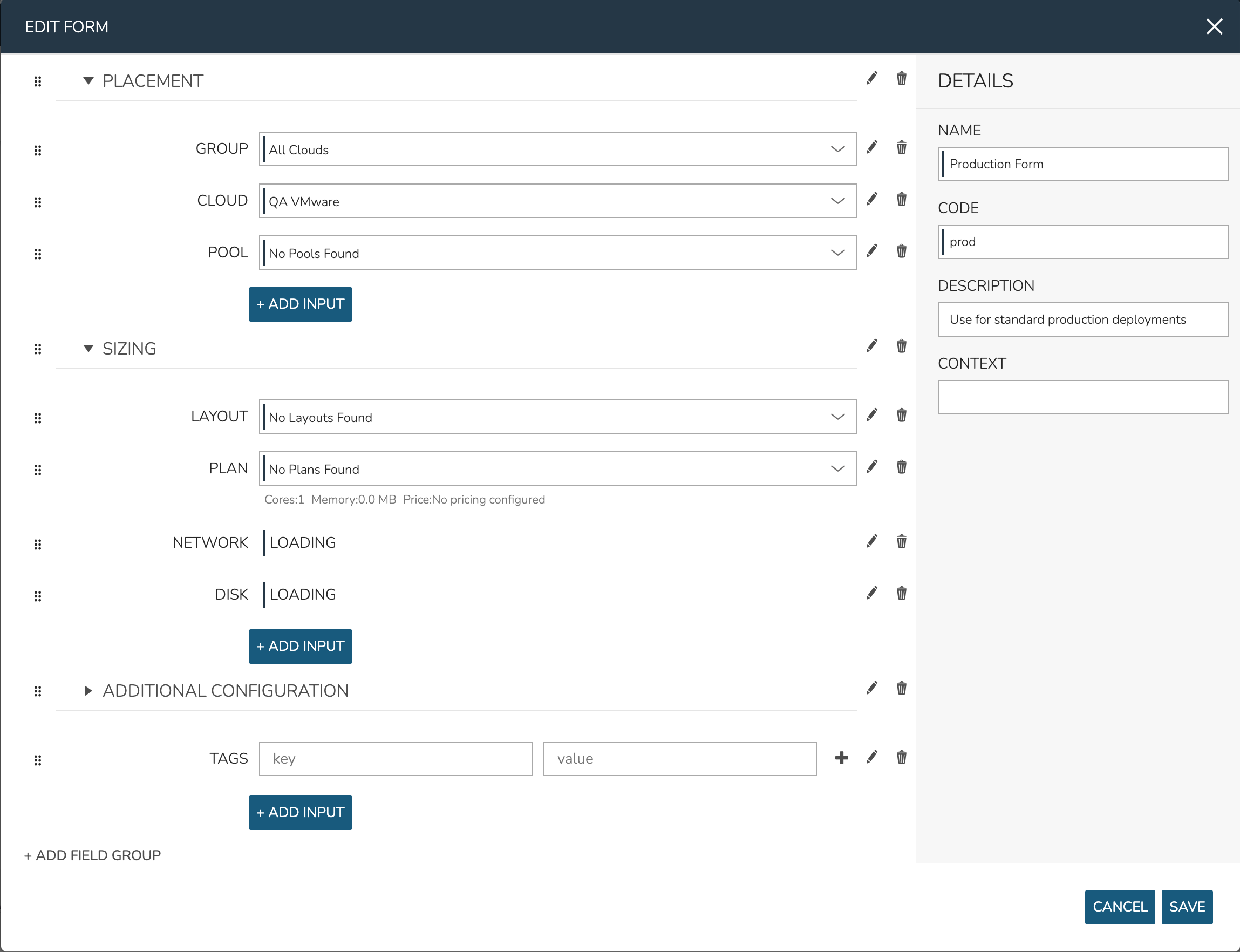
A complete example form making use of provisioning Inputs and Field Groups is shown below:
Using Localized Labels on Form Fields
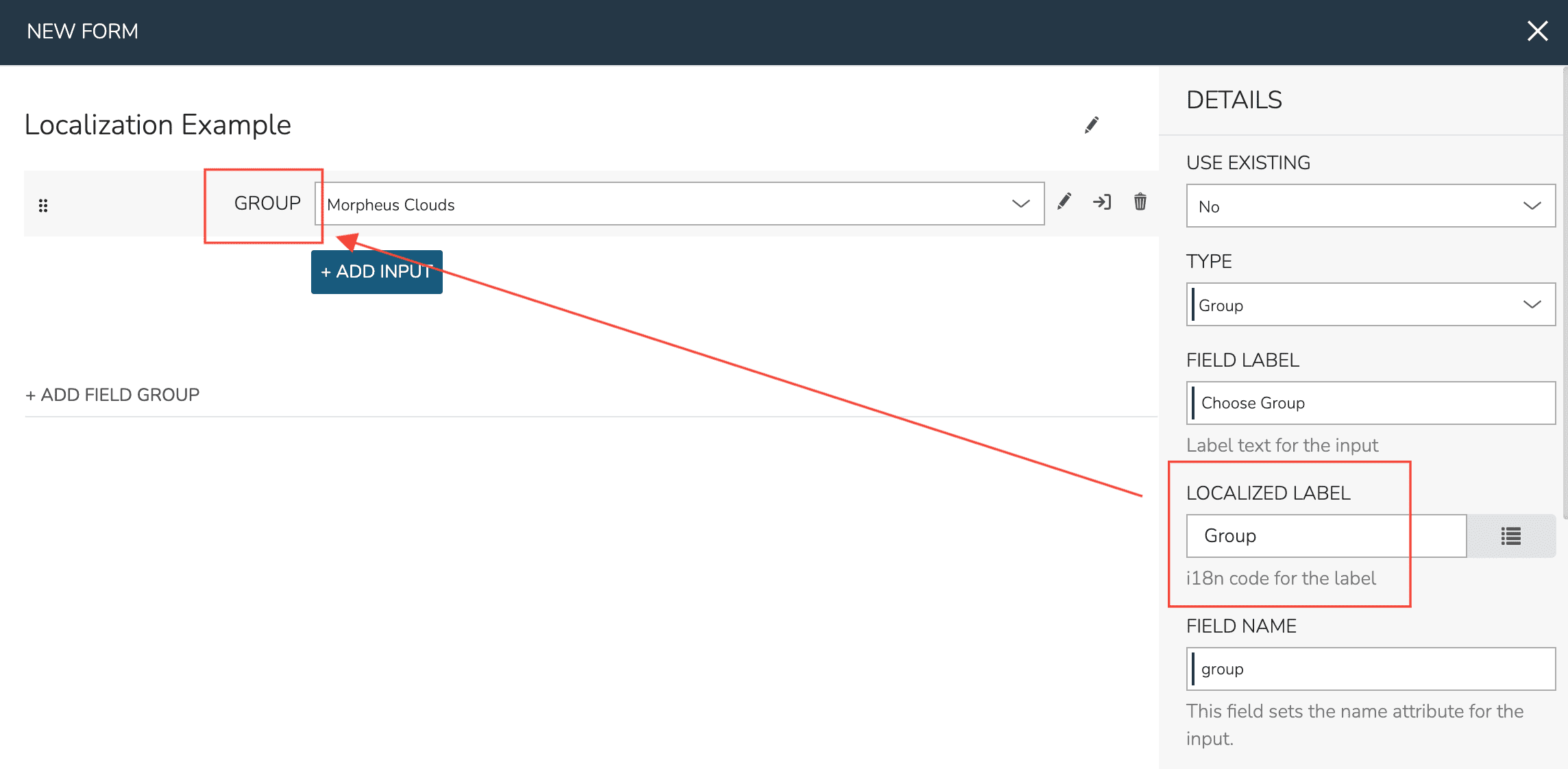
In creating a Form Input, you may enter a custom static text label by setting the FIELD LABEL attribute on the Input. Using this will set a label for your Form field which will appear the same for all users. Alternatively, you can set a dynamic text label by selecting an entry from the LOCALIZED LABEL typeahead field. By setting a Localized Label, the label will appear differently depending on the user’s web browser language localization setting, the HPE Morpheus Enterprise appliance localization setting (set in the global settings area), or the user’s own localization setting from within the User Settings section. More specific localization settings (such as a user’s setting over the appliance-wide setting) override less specific settings.
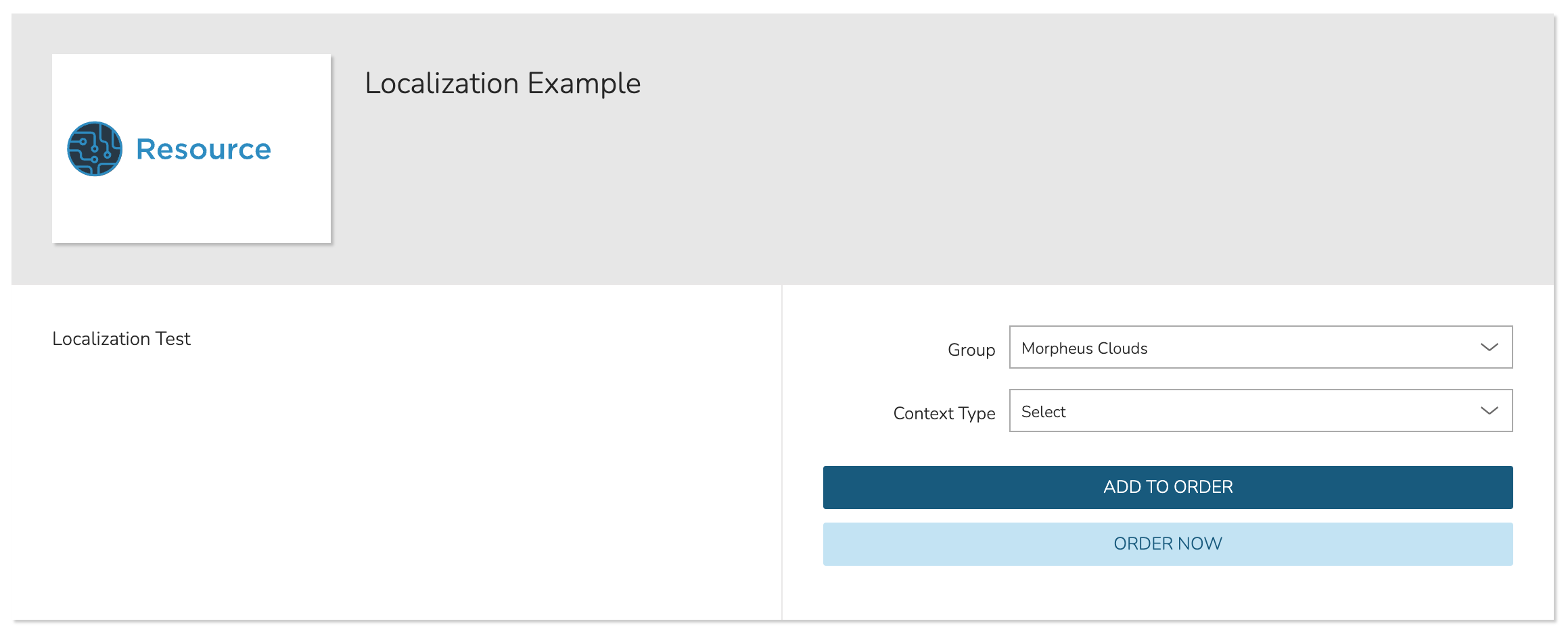
As an example, I’ll create a simple Form which has only a Group-type Input. Both the Field Label and Localized Label fields have been filled but the Localized Label takes precedence. Based on the localization settings for the user creating this Form, we see the label presented in US English as “GROUP.”
If we then navigate to provision a Catalog Item based on this Form, we still see the US English “GROUP” field label as this specific user has a default localization of “English (United States)” in its User Settings menu.
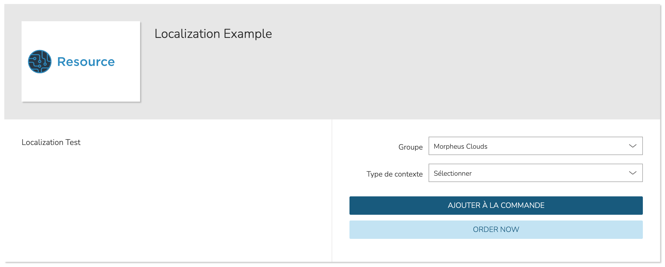
However, if we select a different user which has a default localization of “French,” and go to provision the same Catalog Item, the field label is shown in French.
HPE Morpheus Enterprise has several complete language packs and also allows users to contribute to new or in-progress language packs. If interested in creating or contributing to UI translations, take a look at this YouTube video.
Turning Forms into Catalog Items
Once created, Forms can be associated with Catalog Items in the same way individual Inputs could before Forms were added. Add a new Catalog Items (or edit an existing one) in Library > Blueprints > Catalog Items. For complete details, refer to documentation on creating Catalog Items.