Inputs
Inputs are custom input fields that can be added to Instance Types and Layouts, then presented in Instance, App, and Cloning wizards. The resulting value is available in the Instance config map as <%=customOptions.fieldName%> or <%=customOptions[‘fieldName’], the latter syntax being required in certain situations such as when the field name contains a hyphen “-” (ex. <%=customOption[‘my-field-name’]). The fieldName and value can also be exported as Tags.
Create Input
Note
All possible fields listed. Displayed fields depend on TYPE selection
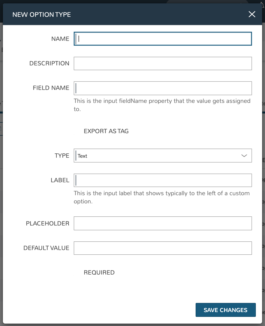
- NAME
Name of the Input
- DESCRIPTION
Description for reference in Input list view
- FIELD NAME
This is the input fieldName property that the value gets assigned to
Note
Field names should only contain letters, numbers, and hyphen (-), underscore (_), or dot’.’ for separation.
- EXPORT AS TAG
Creates Tags for fieldName/value (key/value) on Instances
- HIDDEN
When marked, this Input will be hidden from the user but the value will still be accessible. This allows for alternate Input types to be used as hidden Inputs than what is possible with “Hidden” type Inputs (described further below). This is also different from Input “Visibility” settings as the values of non-visible Inputs is not accessible for consumption in automation routines
- DEPENDENT FIELD
The Field Name value for a field that will reload this Option List to present a different set of selections. Take a look at the section below on Cascading Inputs as well as the associated article in our KnowledgeBase for documented examples of this feature
- VISIBILITY FIELD
A Field Name and selection value that will trigger this field to become visible. Currently, this only works when the Input is associated with a Service Catalog Item and viewed from the Service Catalog Persona perspective. See the section below on the Visibility Field for instructions on configuring this value. It should also be noted that when an Input is not visible, its value is not available for consumption in automation routines. Use the “Hidden” flag (see above) to configure hidden yet accessible values
- REQUIRE FIELD
A fieldName that will trigger required attribute of this option
- SHOW ON EDIT
Display the Input name and value when editing an Instance
- EDITABLE
Allow the Input value to be updated when editing an Instance (This attribute is hidden if SHOW ON EDIT is not selected)
- DISPLAY VALUE ON DETAILS
When selected, the Input label and value (label: value) will be visible in a list of custom options on the Instance detail page
- TYPE
Text: Text Input Field
Text Area: A text area input, when selected an additional option appears to allow the user to configure the default number of visible rows in the text area
Select List: Populated by Option Lists, presents a manual or REST-populated dropdown list
Checkbox: Checkbox for
onoroffvaluesNumber: Input field allowing only numbers
Typeahead: Populated by Option Lists: Rather than presenting a potentially-large dropdown menu, the user can begin typing a selection into a text field and choose the desired option. Multiple selections can be allowed with this type by marking the ‘ALLOW MULTIPLE SELECTIONS’ box
Hidden: No field will be displayed, but the field name and default value will be added to the Instance config map for reference
Password: An input field with suitable encryption for accepting passwords
Radio List: Populated by Option Lists, presents a selection of radio buttons for the provisioning user
- LABEL
This is the input label that typically shows to the left of a custom option
- ROWS
For
Textareatype Option Lists, determines how many text rows will be given when the Input is presented- PLACEHOLDER
Background text that populates inside a field for adding example values, does not set a value
- DEFAULT VALUE
Pre-populates field with a default value
- HELP BLOCK
Helpful text that will appear under your Input field to inform users about their selection
- REQUIRED
Prevents User from proceeding without setting value
- REMOVE NO SELECTION
For Select List-type Inputs. When marked, the Input will default to the first item in the list rather than to an empty selection. This is especially useful when only one choice is anticipated to be in the list as it saves the user from manually making a default selection
- VERIFY PATTERN
For Text and Text Area-type Inputs. If desired, enter a regex pattern string and user entries must match the string to be accepted
Verify Pattern Demo
- DEFAULT CHECKED
For
Checkboxtypes, when marked the Checkbox will be checked by default- OPTION LIST
For
Select Listtypes, select a pre-existing Option List to set dropdown valuesNote
Select ListandTypeaheadInputs require creation and association of an Option List
Cascading Inputs
One powerful facet of HPE Morpheus Enterprise Inputs is the ability to present users with different lists of input options based on their selections in other Inputs within the same wizard or modal. One common example, which is fully illustrated in this section, is to have a user select:
The Group they wish to provision into…
Then select the target Cloud from a list limited to Clouds which are in the selected Group…
Then select the target network from a list limited to networks which are available to the selected Cloud and Group
To set this up, we will first configure our Inputs (custom option fields that can be applied to Instance Types and other HPE Morpheus Enterprise constructs) and Option Lists (dynamic lists of possible choices which can be associated with Inputs and presented in a dropdown or typeahead format). Once the custom options are configured, we will associate them with a new service catalog item and take a look at how the user would interact with them.
Group Custom Options
To begin, we will create a new Option List In this case, we will select type of “Morpheus Api” which will populate the list based on a call to the internal HPE Morpheus Enterprise API. Option Lists can also be populated by calls to external REST APIs or even from static lists that you enter manually. When dynamically populating Option Lists, whether via HPE Morpheus Enterprise API or an external API, translation and/or request scripts may be needed to prepare the request or translate the results. More on that as we build out the example.
I have called my Option List “Groups” and selected “Groups” from the OPTION LIST menu. This simply indicates that Groups are the construct we want to call into our list from HPE Morpheus Enterprise API. In this case, we want to present a list of all Groups to the user by their name and pass the Group database ID in the background. Since it is common to create Option Lists from HPE Morpheus Enterprise API where the construct name is displayed to the user and the ID is passed, we actually do not need to input any translation scripts in this case. However, I will include a translation script here which does the same thing simply to provide more clarity to the example. HPE Morpheus Enterprise Option List documentation includes additional details on available translation script inputs and which are available without translation as a convenience feature.
for (var x = 0; x < data.length; x++) {
  results.push({name: data[x].name, value:data[x].id});
}
After saving the Option List, create the Input that presents the list we just created. I gave my Input the name of “Selected Group”, field name of “selectedGroup”, and label of “Group”. For type, choose “Select List” and a new field will appear at the bottom of the modal where we can select the Option List we just created. With this configuration, the Input will present as a dropdown list containing the options called from our Option List.
Cloud Custom Options
Adding the Option List and Input for Clouds will be similar to the prior step with the exception that we will be including a request script which effectively filters the list of available Clouds to only those associated with the selected group. Follow the same process to start a new Option List, I have configured mine as follows:
NAME: Parsed Clouds
TYPE: Morpheus Api
OPTION LIST: Clouds
We also need a request script that loads the siteId attribute of the results variable with the Group ID if the user has made a group selection. Essentially it appends this input as a query parameter to the API call, calling (for example) ./api/clouds?siteId=1 rather than .../api/clouds. It should be similar to the script below. Note that we are referencing the selectedGroup field name we created previously and that a “site” is the term for Groups in the HPE Morpheus Enterprise database.
if (input.selectedGroup) {
  results.siteId = input.selectedGroup
}
We also need a translation script which will be identical to the one used previously with the exception that if there is no input on the selectedGroups field, nothing will be displayed for the Clouds option.
if (input.selectedGroup) {
for (var x = 0; x < data.length; x++) {
    results.push({name:data[x].name, value:data[x].id});
  }
}
We also need to create an Input to house this Option List. This process will be very similar to creating the previous Input except that we need to set selectedGroup as the Dependent Field. Setting a dependent field on an Input will trigger it to reload each time a selection is made in the indicated option. My configuration is as follows:
NAME: Parsed Cloud
FIELD NAME: parsedCloud
DEPENDENT FIELD: selectedGroup
TYPE: Select List
LABEL: Cloud
OPTION LIST: Parsed Clouds
Save your changes once done.
Network Custom Option
Finally, we will create an Option List/Input pair for network selection. In this case, it will be dependent on both the Group and Cloud selection. My Option List configuration is below:
NAME: Parsed Networks
TYPE: Morpheus Api
OPTION LIST: Networks
Request Script:
if (input.parsedCloud && input.selectedGroup) {
  results.cloudId = input.parsedCloud
  results.groupId = input.selectedGroup
}
Translation Script:
if (input.parsedCloud && input.selectedGroup) {
for (var x = 0; x < data.length; x++) {
    results.push({name:data[x].name, value:data[x].id});
  }
}
The Input is configured as follows:
NAME: Parsed Networks
FIELD NAME: parsedNetwork
DEPENDENT FIELD: parsedCloud
TYPE: Select List
LABEL: Network
OPTION LIST: Parsed Networks
Setting Custom Options at Provision Time
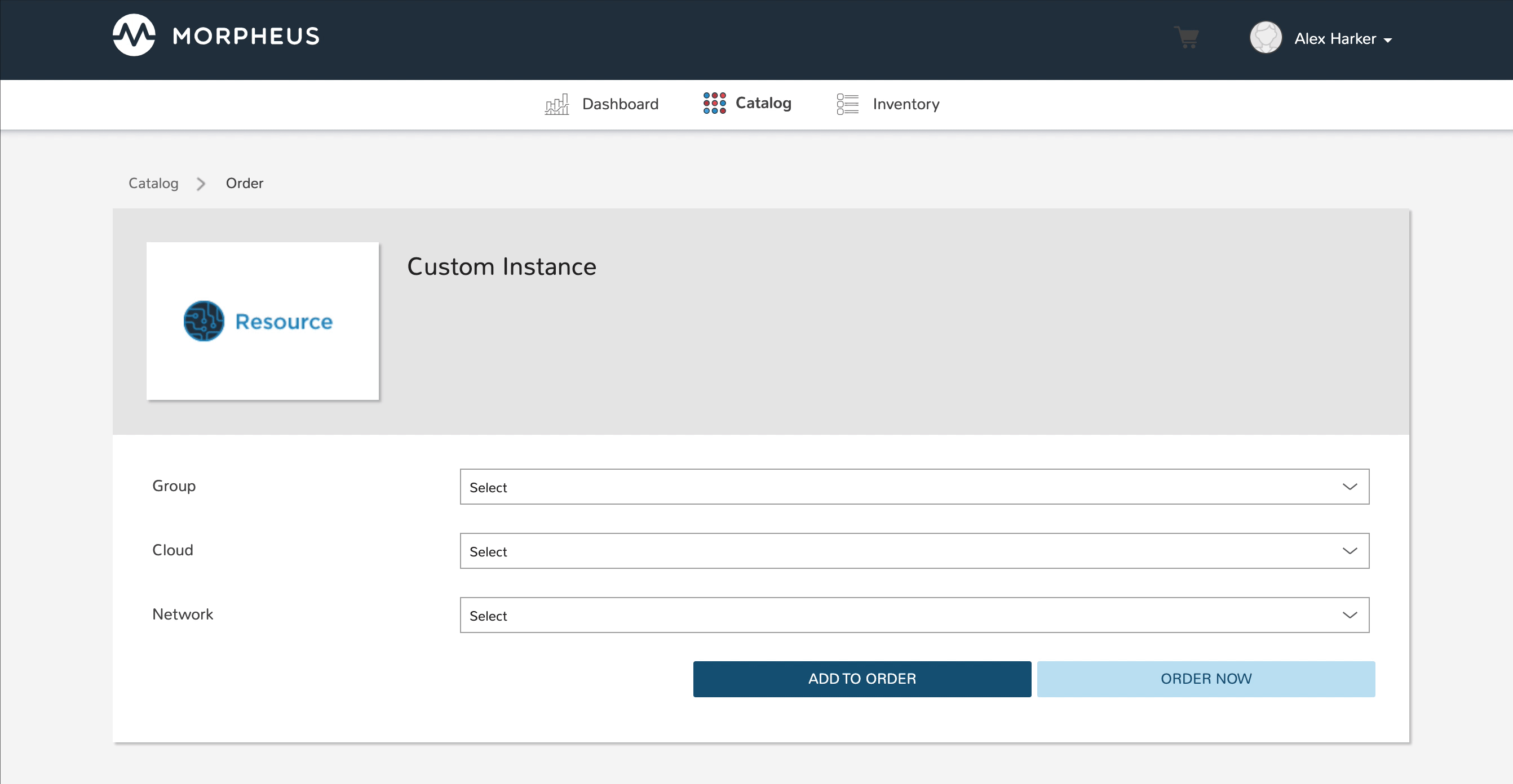
At this point, our dependent options are ready to be applied to custom Instance Types, Workflows or Service Catalog items as needed. When creating them, we can select an unlimited number of Inputs from a typeahead field on the create modal and they will be presented when a user goes to provision that element or run that Workflow. As an example, I have created a Service Catalog item that incorporates the three Inputs we have created. You can see how the dependent fields reload and present different options based on my selections.
Visibility Field
The Input Visibility field allows users to set conditions under which the Input field is displayed. Visibility field accepts fieldName:value or fieldName:(regex), where “fieldName” equals the fieldName of another Input which will determine the visibility of this Input, and “value” equals the target value of the other Input (or a regex pattern that matches to the values that meet your desired conditions). You can simply enter “fieldName” when visibility should be triggered when any value is entered. When the value of the target Input matches the “value” or “(regex)” set in the Visibility field, this Input will be displayed. When the value of the target Input does not match “value” or satisfy the “(regex)” set in the Visibility field, this Input will not be displayed.
Expanding on the simplified example above, we could trigger visibility based on any one of multiple selections from the same Input by using a different regular expression, such as color:(red|blue|yellow). Additionally, we are not restricted to the conditions of just one Input to determine visibility as the following would also be valid: color:(red|blue|yellow),shape:(square). In the previous example, the Input “Color” would have to be set to red, blue, or yellow OR the Input “Shape” would have to be set to square in order to trigger visibility of the Input currently being configured. Prepend the previous example with matchAll:: in order to require both conditions to be met rather than one or the other (ex. matchAll::color:(red|blue|yellow),shape:(square)).
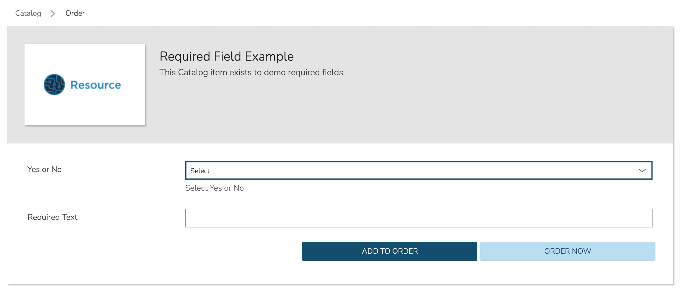
Required Field
The Required field allows for Inputs to be conditionally required. In this field, enter the Field Name value for another Input and, if that Input is filled by the user, the current Input will become required. This feature could also be used in conjunction with the Visibility field described above in that you may want a field to be required when visible but not required when hidden. Below is a simple abstract example showing how the second displayed Input becomes required when the first displayed Input is filled.